5 Psychological Triggers You Can Add to Your Website to Get More Sales
Conversion rate optimization (CRO) isn’t a walk in the park.
After all, a website is like a jigsaw puzzle that you must piece together perfectly if you want profitable results. Headlines, form fields, images, call-to-action (CTA) buttons — there’s just so many components to mix and match.
Granted, you’re probably already aware of these basic conversion elements, considering the fact that they’re mentioned in countless of guides out there on CRO. You may overlook, however, the psychological triggers that can affect your target audience on a more personal level are the ones that can help you get more sales.
Remember that humans respond strongly to emotions, be it fear, greed, happiness, or anger.
By understanding and utilizing the triggers that cause these emotions to surface, you can compel your audience to commit to an online transaction — from signing up to a newsletter to purchasing whatever product you have in store for them.
Without further ado, here are the top five psychological triggers you can incorporate into your website to supercharge conversions.
#1. A Strong First Impression (Authority)
Psychology states that first impressions last, and the same rings true for online experiences.
It’s not rocket science: most, if not all, online users will remember your brand based on their first encounter with your website.
This begs the question, what is the first thing they’ll see on your site? Is it a powerful value proposition that directly addresses their pain points or a header that’s laden with banner ads that do nothing but slow the site down?
High-caliber marketers like Brian Dean of Backlinko know this, which is why they often greet newcomers with a straightforward value proposition:
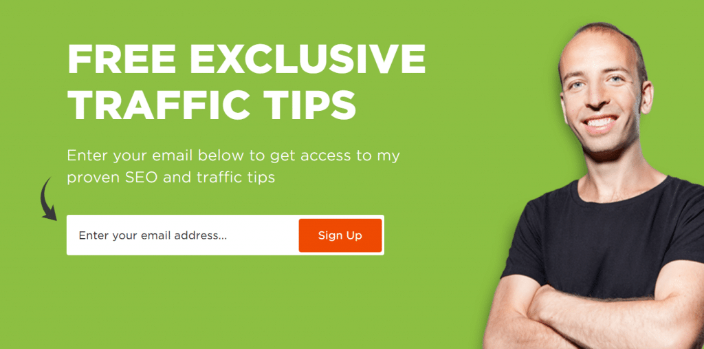
The delivery of your value proposition is, of course, just as important as the message itself. That said, you must pay attention to other on-page elements that constitute the user experience:
- Use directional cues
In the example above, you can see that Backlinko added a tiny arrow that points to the opt-in form. It may be subtle, but it definitely helps maximize the visibility of core conversion elements.
- Improve loading speed
Whether you like it or not, users nowadays are easily frustrated with a slow website — with 40% of them leaving if it takes more than three seconds to load. Fortunately, there are many ways to remedy this; from using CDNs to automate compression, choosing the right hosting options, to enabling browser caching.
- Limit distractions
As far as web page design goes, less is often more. Make sure important elements stand out by eliminating needless clutter.
- A/B Test
To help you determine the best layout for your website in the shortest possible time, use split testing strategies that are supported by your website platform.
#2. Social Proof (Trust)
Every online conversion ever closed wouldn’t be possible if the audience didn’t trust whoever’s on the other side of the deal.
Remember that, as an online brand, trying to convert a visitor is already asking them for a lot. You wouldn’t just surrender your contact information or hard-earned cash to someone you don’t see face-to-face, right?
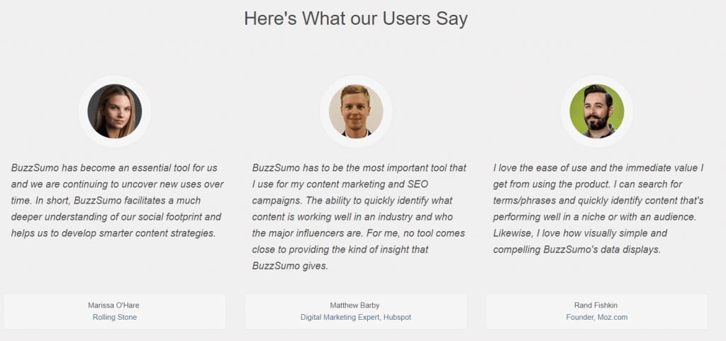
That’s why the online audience tends to follow the masses when it comes to their buying decisions. In their eyes, there’s no one else more trustworthy than someone who has “been there and done that.”
You can take advantage of this by utilizing user-generated content (UGC) into your landing pages. This includes customer reviews, testimonials, and social media posts.
Apart from utilizing UGC, there are several other strategies to build trust in your brand:
- Offer valuable and relevant content through a blog for free.
- Encourage and respond to comments in your content or social media pages.
- Use PageSpeed Insights to analyze and improve your website’s performance over time.
#3. The Rule of Reciprocation (Gratitude)
Believe it or not, humans are hard-wired to feel the urge to return favors.
Psychologists call it the law of reciprocity or rule of reciprocation, and when used right, it’s a great way to make your prospects feel almost obliged to convert.
A popular strategy is to provide an opt-in offer or “bribe” in exchange for their email address. It can be an eBook, a free trial version of a premium app, an online course subscription, and so on.
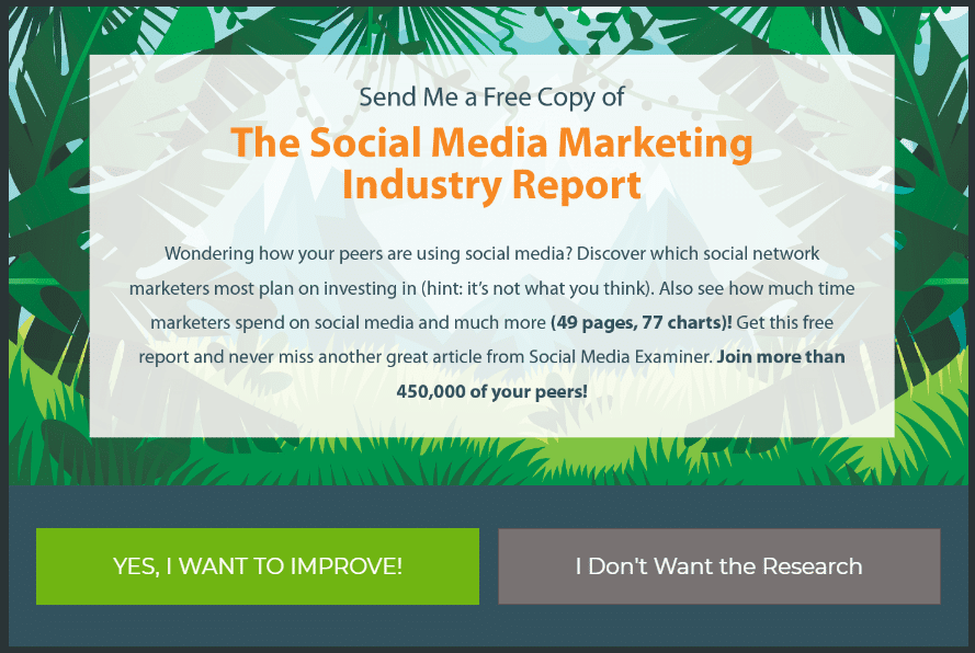
Another strategy is to implement content gating, which is the practice of requiring visitors to provide their email address if they want to read your full content.
Of course, you need to establish your credibility as an information source in order for content gating to work. As such, gated content must be backed with sufficient page elements that build trust — or, a separate section for “free users” who are interested in getting to know your brand first.
#4. Urgency (Fear)
If there’s one emotion that will surely trigger an emotional response in your audience, it’s none other than fear.
Losing money, missing out on something, failing in business — there are countless of ways fear can urge a person to take action. And as a marketer, it doesn’t take that much to stimulate and capitalize the fear of your potential leads.
Quicksprout, for example, utilizes fear quite extensively in their lead generation strategy.
The centerpiece in their strategy is a free “analysis tool,” which will then claim that it has detected “errors” on the user’s website.
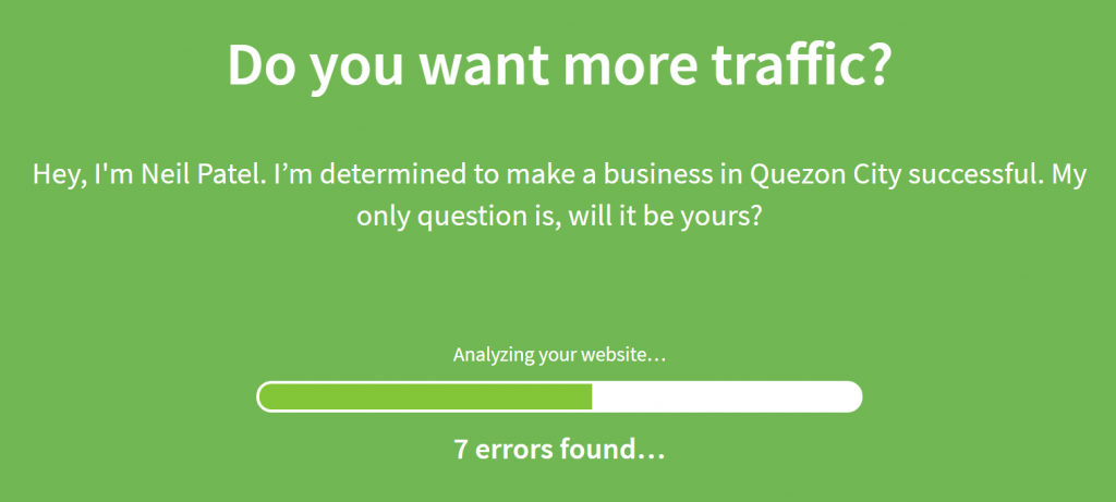
After the analysis, users are then met with another psychological trigger that pretty much seals the deal.
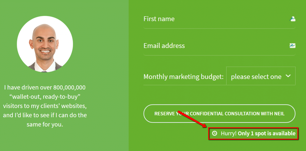
Clever, right?
Not only are users made aware of the consequences of not converting (the “errors”), they are also told that they’re working on a small window of opportunity (only “1” spot left) — thus, instilling them with the sense of urgency.
#5. The Right Colors (Familiarity)
Finally, a little color psychology can go a long way, especially from a marketing standpoint.
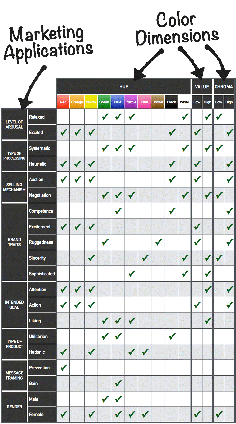
There are several, well-documented pieces of evidence that support the notion that certain colors do, indeed, encourage a specific emotional response. Red, for example, is shown to cause people to react faster and more forcefully, while blue is often associated with the feelings of relaxation, calmness, and confidence.
To help you decide what particular color suits your brand’s image and value propositions, you can refer to the color emotion table below:
Final Words
Remember that online success isn’t just about getting qualified traffic to your website — it’s about creating an experience that will encourage your audience to immerse into the conversion funnel you’ve set up for them.
The psychological triggers mentioned above may not always be the most noticeable elements on your website, but they undoubtedly play a pivotal role when it comes to providing your audience with a compelling and memorable experience.
Have other conversion-inducing psychological triggers you’d like to share? I’d love to hear about them in the comments below! Cheers!
Marc Sullivan
Latest posts by Marc Sullivan (see all)
- 7 Marketing Strategies That Can Get You More Sales While Spending Less - October 5, 2018
- 4 Marketing Strategies that Every Online Store Owner Needs to Know - August 29, 2018
- 5 Psychological Triggers You Can Add to Your Website to Get More Sales - May 30, 2018


