Logo Design For Restaurants: Appetizing Visual Branding
In the competitive landscape of the restaurant industry, branding is more critical than ever. A well-designed logo serves as a cornerstone for any successful restaurant, setting the stage for customer expectations and overall experience.
In this article, we delve into the nuances of creating an effective and appetizing visual brand through your restaurant’s logo. From essential design elements to common mistakes, you’ll gain valuable insights to help you navigate the world of restaurant logo design.
The Significance Of A Restaurant Logo
The logo is often the first thing customers see when they encounter your restaurant, whether it’s on a website, social media, or the front sign. Consequently, it sets the tone for what patrons can expect from your establishment. Whether you’re aiming for a casual or upscale vibe, the design elements you choose are crucial. They provide visual cues that can either attract or deter potential customers.
Equally important is the logo’s role as a visual identifier across various marketing platforms. From online ads to printed menus, your logo will be the consistent element tying all your marketing efforts together. It’s what makes you instantly recognizable in an increasingly crowded marketplace. If you’re just starting out or considering a rebrand, tools like a restaurant logo maker can streamline this process, allowing you to create a professional logo without needing advanced design skills.
Lastly, a carefully crafted logo aids in differentiating your restaurant from competitors. With so many options available to diners, having a unique and compelling logo can give you the competitive edge needed to stand out. This importance only heightens in specialized markets where multiple establishments might offer similar types of cuisine or dining experiences.

Key Elements In A Restaurant Logo
When it comes to crafting a logo that captures the essence of your restaurant, several key elements demand your attention.
One of the most critical factors is color. Different colors elicit distinct emotional responses. For example, red often invokes feelings of excitement or passion, making it popular in fast-food logos. Blue can exude tranquility, which might be suitable for a relaxed café setting.
Businesses often draw inspiration from different themes, not just in their logo but also in things like coffee packaging ideas, to create a consistent brand narrative.
- Font Selection
Another pivotal element in logo design is the choice of font. The typography you select should be easily readable, allowing for immediate brand recognition.
Beyond mere readability, the font style also sets the tone for your restaurant. Beyond a vast range of free fonts, a serif font may convey a sense of tradition or sophistication, while a sans-serif font often feels more modern and approachable. Therefore, the chosen font needs to align with the brand’s overall image and the kind of dining experience you wish to offer.
- Symbols And Imagery
Lastly, symbols or images included in the logo should serve a purpose. These visual components need to resonate with your target audience and effectively represent your brand.
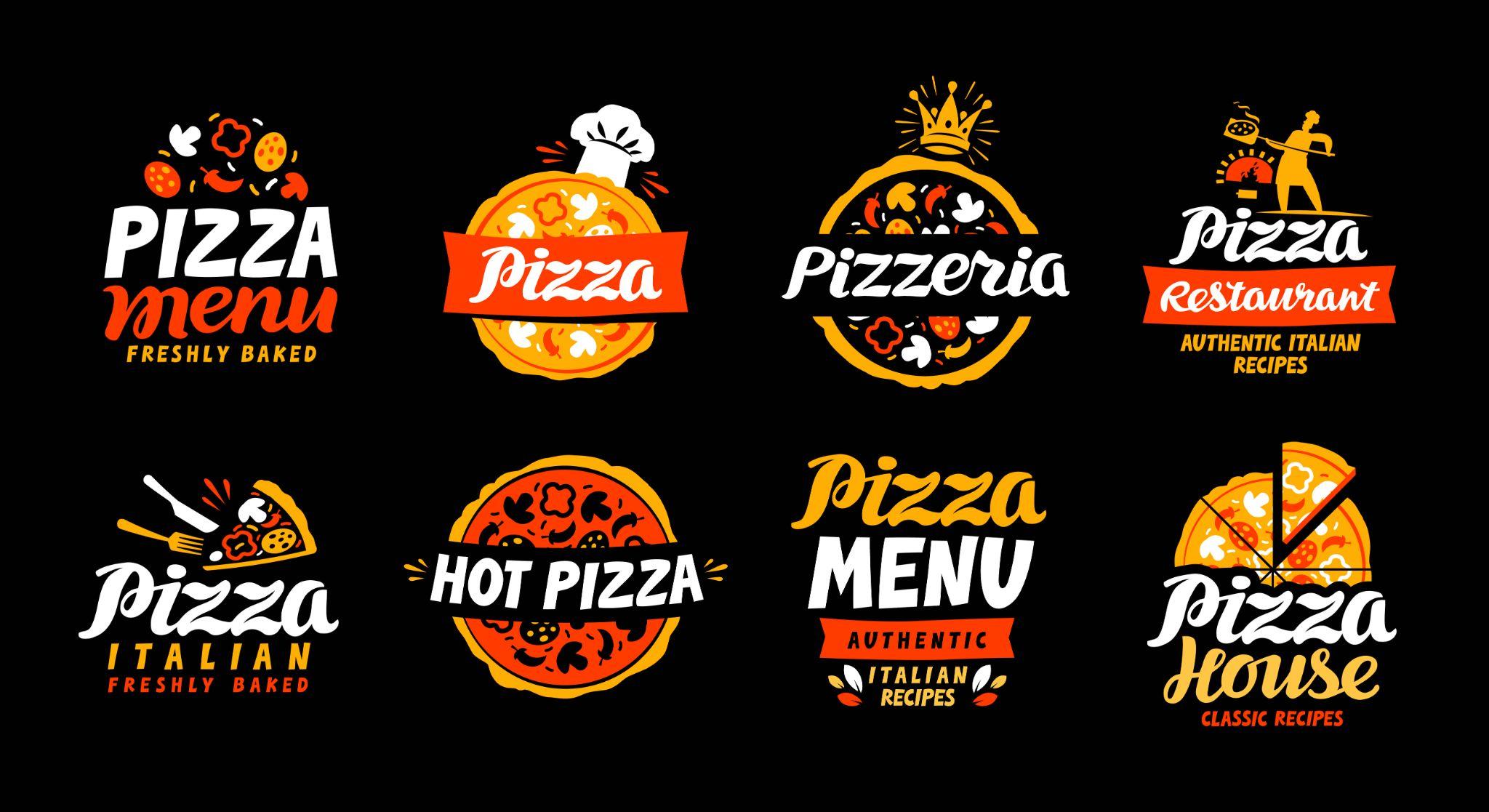
For example, a pizzeria might incorporate a stylized pizza slice, while a sushi restaurant could feature an elegant fish or a piece of sushi. The image should be straightforward yet impactful, encapsulating your restaurant’s essence in a single glance.
Understanding and skillfully implementing these key elements can dramatically influence the effectiveness of your restaurant’s logo. It’s not just about making something that looks good; it’s about creating a visual representation that aligns perfectly with your brand’s values and goals.
How To Start The Design Process
Ready to design a standout logo for your restaurant? This section breaks down the basics: pinpointing your unique traits, choosing a design style, and selecting the right design tools or experts.
- Pinpointing Your Restaurant’s Unique Attributes
Initiating the logo design journey begins with a clear identification of your restaurant’s unique selling points. Are you a farm-to-table establishment focusing on organic ingredients, or perhaps a fast-food joint with a secret sauce that everyone raves about? Understanding what sets you apart will guide you in crafting a logo that truly encapsulates your brand’s essence.
- Choosing A Design Aesthetic
Once you’ve identified what makes your restaurant special, the next step involves determining the design direction. Do you envision a modern and minimalistic logo, or are you leaning toward a more classic or even quirky aesthetic? This decision will significantly influence the design elements you’ll use, from color schemes to typography.
After honing in on your restaurant’s unique features and deciding on an aesthetic, you have two primary paths to proceed down. One option is to consult with a skilled designer who can translate your vision into a visually appealing logo.
Alternatively, you could make use of specialized design software to create the logo yourself. Either route you choose should be aligned with both your brand’s needs and the resources you have at your disposal.
Knowing your restaurant’s unique features and choosing a fitting design direction are crucial first steps. Whether you consult a professional or use design tools, this groundwork will set the stage for a compelling restaurant logo.
Mistakes To Sidestep
Avoiding common pitfalls is crucial in logo design for restaurants. Here are some mistakes to steer clear of for a more effective and memorable logo.
- Avoiding Overcomplicated Designs
A common pitfall in logo creation is making the design too complex. Overcomplicated logos can confuse customers and dilute your restaurant’s message. Keep it simple; a straightforward design often has a bigger impact and is easier to remember.
- Maintaining Brand Consistency
Another mistake is ignoring brand consistency. Your logo isn’t a standalone piece; it should fit seamlessly with your other branding elements. Whether it’s your menus, website, or social media, maintaining a consistent visual identity strengthens your brand’s recognition.
Lastly, avoid generic or overused elements like stock images or common fonts. Your logo should be unique to your restaurant and not remind customers of other brands. A distinct logo will help your establishment stand out from the competition and draw more customers in the long run.
Sidestepping these mistakes can make your restaurant logo more effective and memorable. By focusing on simplicity, consistency, and uniqueness, you’ll create a strong visual identity that appeals to your audience.
Conclusion
Effective restaurant logos are more than just pretty pictures. They combine well-chosen colors, fonts, and symbols to evoke the essence of the dining experience. Investing in a good logo pays off by making your brand easily recognizable and resonating with your target audience. It’s an investment that supports your marketing efforts and contributes to your restaurant’s success.
Chandni Panjwani
Latest posts by Chandni Panjwani (see all)
- 10 Examples of Great Copywriting in an E-Commerce Store - December 18, 2023
- Crafting A Memorable Brand: The Importance Of Mockups - December 6, 2023
- Navigating the Digital Landscape: Strategies for a Robust Online Marketing Presence - November 21, 2023


