Using Unique Graphics to Promote Your Blog Post – A Work Flow
One of the most compelling ways to promote your blog post or written content is to use imagery to engage your viewers. No doubt, you’ve heard this before. But how do you find or create unique visuals that both look good and increase your conversions?
That’s exactly what we will be discussing in this article.

Deciding which images to use when trying to drive traffic to any destination on the web is critical. For blogs, it is an essential part of introducing people to your brand, getting them to read your content, and convincing them to subscribe. Without graphics that entice viewers to do something, your job becomes much more difficult.

That’s why we’ve put together this complete guide on how to promote your blog post which takes you through every step of the process. By following these steps, you’ll no longer have to worry about whether or not your visual elements are working the way you need them to.
#Step 1. Promote Your Blog Post – Choose the Right Image
People make this mistake all too often: taking the first photo from Shutterstock (or whatever stock image site you use) that remotely relates to your topics, and running with it. This is arguably a very convenient way to do things, but aside from being convenient, it does not benefit you or your brand in any way.
The internet is FULL of these images, everywhere you look. These images are often corny or staged, offering no authenticity or stimulation to your viewer. When people see these images, they automatically think “Boring! Let’s keep scrolling!” – the complete and total opposite of what you want them to do.

Instead of choosing the first image you find, try searching for stock photos that have a more natural and relatable feel to them. Find photos where the subjects aren’t posing unusually, or that look like they were taken in a real-life setting – a coffee shop, an apartment, office etc.

Avoid photos with all-white backgrounds, unless you specifically need one for graphic design reasons (i.e. needing to put text over the background). Also, try to find engaging photos of people rather than objects, when possible.

If you have the ability to take your own photos or hire a professional to take some, this is always most recommended. Nothing captures the attention of internet users more than new, quality visual content they’ve never seen before!
#Step 2. Promote Your Blog Post – Know Your Platforms
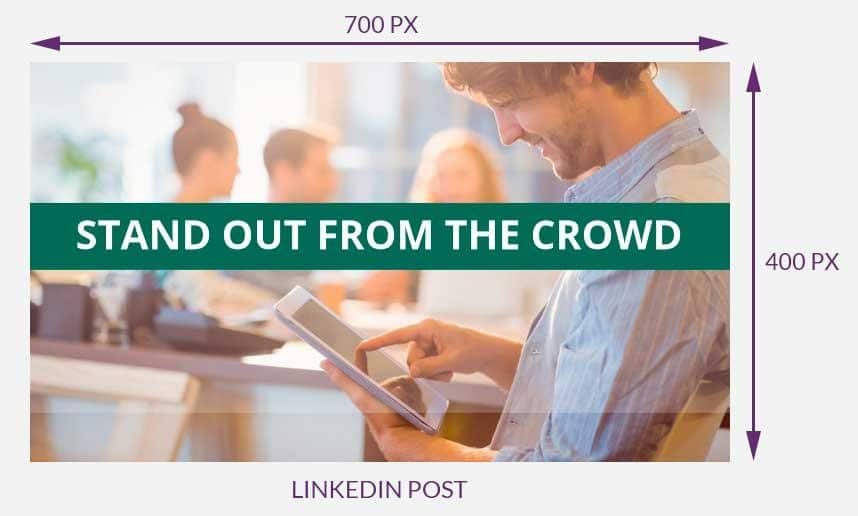
Each social media platform or online image has its own dimensions and recommended sizes. Depending on where you will be using the graphic you create, you will have to design it differently.
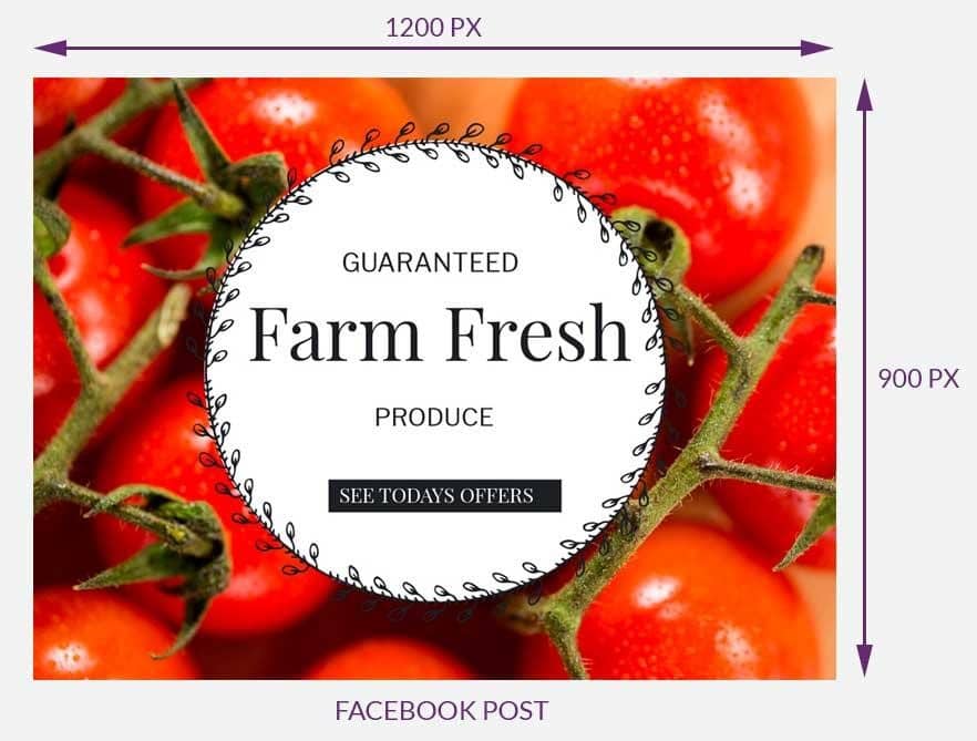
For example, did you know that on Pinterest, all images are vertical rather than horizontal? This is due to the columned layout that Pinterest has adopted. Thus, if you want to promote your blog on Pinterest, you will need to create a graphic that is 735 pixels wide by 1102 pixels high.
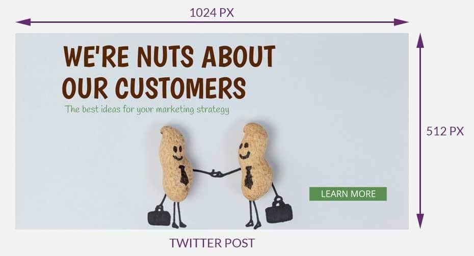
Other social media platforms have different image sizes, depending on where the image is being displayed. Check out this complete 2018 guide to image sizes to learn more about image sizing to ensure you have the correct format!
You can even try using – Design Wizard, an online graphic design software that makes the sizing process simple as it provides you with a large variety of templates in the correct dimensions for various social media platforms.
#Step 3. Promote Your Blog Post – Keep it Consistent
When sharing photos online as a means to achieve a marketing goal, you want to ensure that the photos are branded and visually represent you (or your business). There are several ways you can achieve this, including placing your logo icon on all images, selecting images that match your branded color palette or adding text in your branded fonts. Whichever way you decide to do this, consistency is key.
If you use a filter on your Instagram photos, use that filter consistently instead of going back and forth between a bunch of them. If you use a specific font, stick with it. If your logo is typically in the left-hand corner of your image, keep it there.
Unless you have put considerable thought into re-branding or changing your company image, your visuals should provide your audience with a familiar look that they can easily relate back to your business.
#Step 4. Promote Your Blog Post – Use Blog Headers
Blog headers are graphics that any blogger can create and appear at the top of each individual blog they post. They are great for capturing the attention of readers and for reaffirming your brand. However, you don’t want to make them too complicated. The more text and fonts and visual elements you use, the more overwhelmed users become, and this can actually work against you.
Instead, focus on making your header simple but eye-catching.

Some people choose to make their header their logo, some people choose to make it the title of the blog, and others add in their slogan or tagline. Whichever you choose, you want to ensure your blog header isn’t too busy, and that it speaks to your overall brand. The rest you can feel free to get creative with!

#Step 5. Promote Your Blog Post – Set Your Open Graph Meta Data
Did you know that you can control what image appears when you share your blog post on social media platforms? Using the Yoast SEO plugin with WordPress, you can decide the photo that is displayed on social media, the title that appears for your blog post, and the brief description that appears when you share a blog post on sites like Facebook.

You can access all of these options by clicking on the “Social” tab of the Yoast plugin.
Here, you will see an option called “Featured Image”. This is the image that will automatically appear when you share your blog post on social sites like Facebook and Twitter. If you’d like this image to remain the same as the original featured image on your blog, you do not have to do anything.
But if you’d like to choose a photo specifically for Facebook, you can set another photo. Many bloggers choose a different photo to appear on social media, choosing one that is more personal or one that includes punchier text to increase clicks.
In this same social tab within the Yoast Plugin, you’ll also notice you can change the headline and description that appears when you share your blog post on social media. This is an excellent feature if your blog post has a long title and you want to shorten how it appears on social media so that part of it doesn’t get cut off. It’s also a terrific way to write a short, succinct description that people can quickly read while scrolling!
Once you have implemented these steps, your online visual presence will be solidified, and blog engagement will begin to increase. By visually appealing to the people most likely to be interested in your content, you capture your audience and pull them in. And ultimately, that’s what blogging is all about!
Claire OBrien
Latest posts by Claire OBrien (see all)
- Using Unique Graphics to Promote Your Blog Post – A Work Flow - February 7, 2018


I love articles with a name that catches. You are really right about the fact that graphics help blogs. Now, when the search shifts toward the user (more attention is paid to user feedback). It’s not a secret that graphics are perceived by a person better than text. Especially if it is a little information that a person needs to submit easily and at ease. And the best place for this is a blog! That’s why I started doing graphics (not to be confused with drawing, still computer graphics is different from the usual very, very much), to be engaged in my blog for a project. I looked at how different the usual post differs from the post in which the picture is used, which makes an accent or compliments the post as a whole!
Thank you very much for your information, it turned out to be very useful.