How to Increase User Experience Via Clever Use of Online Forms
Forms are generally boring.
They’re like Monday mornings—dragging and tedious. The poorly created ones are irritating to users too.
Filling up forms is something one doesn’t want to do, but it’s something that needs to be done.
These days, forms are a means of paying for your online purchase, of subscribing to useful apps, or of processing your online applications like your Japan Visa.
Forms are the starting points of things pleasant and important, but how come they’re so drab to tackle?
Good news: They don’t have to be.
Thanks to today’s technology and the sheer creativity of developers, forms can be made clever, beautiful, and fun even.
Here are examples that you can draw inspiration from.
#1. Form in a Button
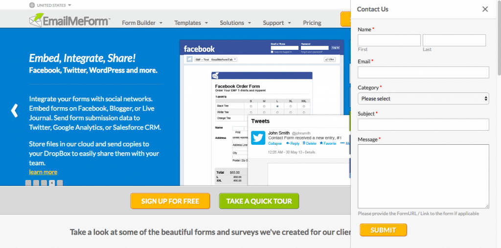
You’ll always see a floating button at the lower right of websites nowadays. They’re usually for live chat options.
The purpose of this is to assist web visitors to easily find what they’re looking for or get their product questions answered. In other words, exposing the means of contacting customer support:
- Make customer acquisition easier
- Hasten purchase decisions
- Save the prospects’ time and effort
These translate to more sales, improved customer satisfaction, and eventually, company growth.
If you feel that a live chat button is a bit aggressive for your taste, do things a little different— have a form pop up in there instead.
It can be a contact form on your homepage, an order form on your online store pages or a contact form on all pages of your website.
#2. Single Line Interactive Form

According to a research, reducing the number of form fields to 4 or less increases the conversion rate by 160%. So what happens when you need to have more fields?
Well, you can hold the users’ attention by using an interactive form that flashes your questions one by one.
This racks up the interest, kills a bit of the formality, lessens the distraction, and gives the user undivided focus on the question. Not flashing all questions at once also eases up a load of filling up long forms or surveys.
#3. A (fun) Quiz
These aren’t the “these will decide my future” quizzes that give you mini heart attacks.
Well, maybe they give you similar sensations, only they’re the good types. Like pleasant panic attacks because you can’t choose between the two celebrities you adore…

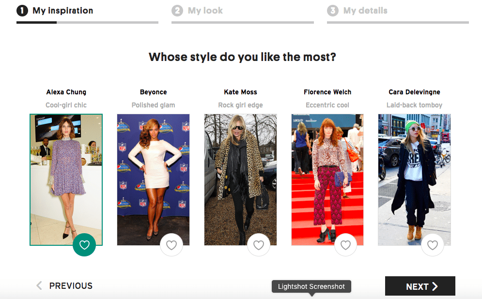
…Or the euphoria of being quizzed about your fashion style. Picking out the pieces that reflect your style almost feels like window shopping.
Topshop uses this form tactic when asking users to sign up. At the end of the quiz, they’ll ask for your email address so they can mail you their shopping recommendation based on the choices that you have made.
And because you get tailored items that suit your style, you’ll be more tempted to purchase from them.
#4. Animations that WOW
Want to be wildly unforgettable to your web visitors at the first visit? Animated forms are surefire ways to leave an impression.
While they may be too fancy for a simple business, they’ll be super effective for graphic- or tech-related biz like a web design agency, design animator or a SaaS company.
Here are 5 awesome form demos:

A virtual x-mark, check mark, circle scratch or encircle to select your answer is way cooler than just clicking on a radio button option.
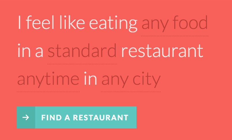
This fill-in-the-blanks kind of form will not ruin your appetite.
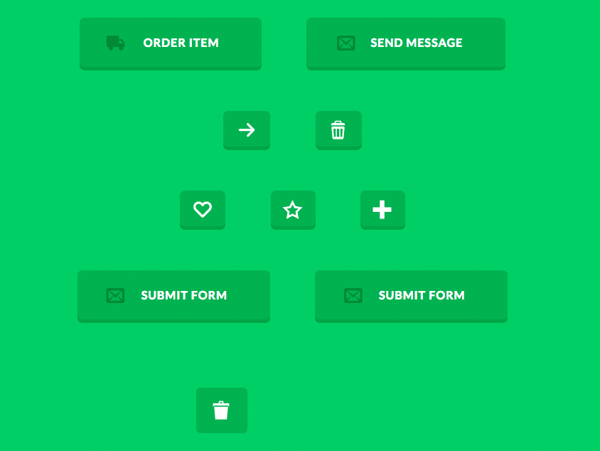
Reward their form filling with delight. Add animated form buttons here and there.
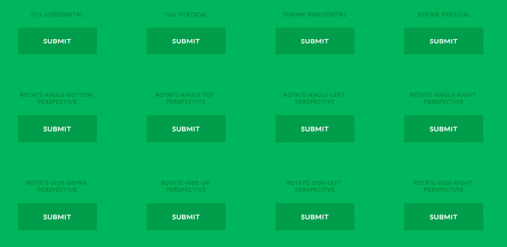
Make them stay for the confirmation message by killing submission time with progress button styles.
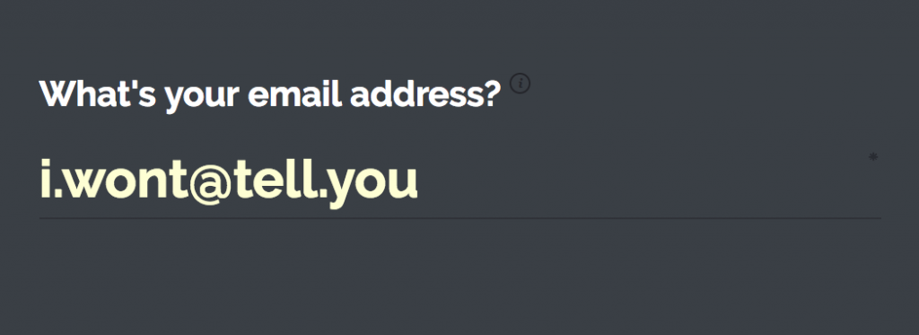
For a totally entertaining (and effective) form user experience, go for a fullscreen form interface.
But before you charm users with your fanciest web form yet…
Got overly inspired by these form examples? Can’t wait to serve up the animated forms 2.0 to your users?
Before you start brainstorming for creating some of the most beautiful forms, stop, breathe, and examine first.
Will the gaudiness of the online form still be appropriate for your audience? How do you think will they react to it? Is the form change still a reflection of your brand? Does it help you nail your project goals?
Better think of these things first to apply just the right amount of cleverness on your forms.
Good luck!
Aiza
Latest posts by Aiza (see all)
- How to Increase User Experience Via Clever Use of Online Forms - April 18, 2018


Hey Aiza,
Loved the way you described forms. As we are Denver Colorado Lawyers, we have to keep up forms on our site so users can instantly find us anytime they need help. Can you please suggest some template for us!
Hi, Eve.
Thank you! Glad that you liked going through the article and that you’re considering using forms.
Forms can help you reach out to your clients in an organized manner. Here are some suggestions:
Adding a contact form with a text box gives your users a way to reach out to you easily regarding their concerns. You can get their email address and phone number so you can get back to them. Here’s a template.
You can also try putting a booking form on your website. You can build up your own form using this template.
Hope you find these suggestions helpful. Just reach out to me if you have more questions about forms.