Boosting Conversions by Putting Landing Page CTAs in the Right Place

Landing pages are designed with the sole purpose of generating more conversions. A conversion can mean closing a sale, gaining an email subscriber, getting a visitor to download an e-book, or even developing a client relationship. Every website is looking to have more and more conversions. However, according to Statista, only 2.23% of visits to e-commerce sites led to purchases in the third quarter of 2019, which is a decline from the previous quarter.
So, what if your landing pages are bringing a lot of traffic to your site, but the conversions are still low?
The problem is most likely your pages’ calls to action.
In this article, we will look at landing page best practices and tactics when putting CTA to convert more visitors who land to your site.
How Important is Your CTA?
The rate of visitors converting on a landing page is affected by the CTA. By simply working on your call to action, you can significantly boost your conversions. A conversion rate below 2%, which is about the industry average, should alarm you. And even if it is higher, there is always room to improve.
Less is More When Creating Forms for Mobile Landing Page
Approximately 79% of mobile phone users bought something online using their phone in 2018. Meanwhile, you might not be maximizing your mobile conversions.
Using one type of form for both mobile and desktop pages might be hurting your e-commerce site. A form that works great for desktop users might be turning off mobile visitors. In the US, 95% of the people have a cellphone, with 77% owning smartphones. That means more people are accessing the Internet on their phones. So, as you optimize your form for mobile, make sure the number of fields as minimal as possible.
For instance, Airbnb has only so many fields on their online form:

Choose Contrasting Call to Action Colors
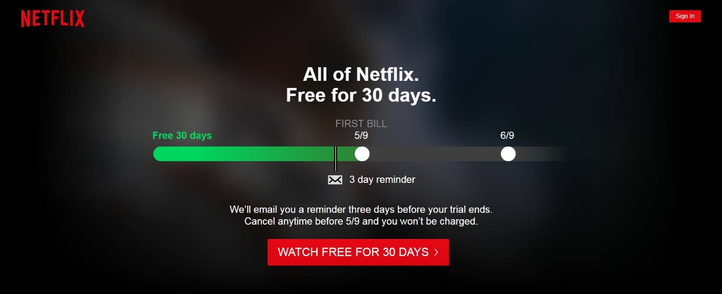
Never have your call to action button similar in color to the webpage. Instead, pick a color that contrasts with the background. Doing this will be quite useful in making faster conversions. Here is a good example from Netflix:
Make the CTA Button Large Enough
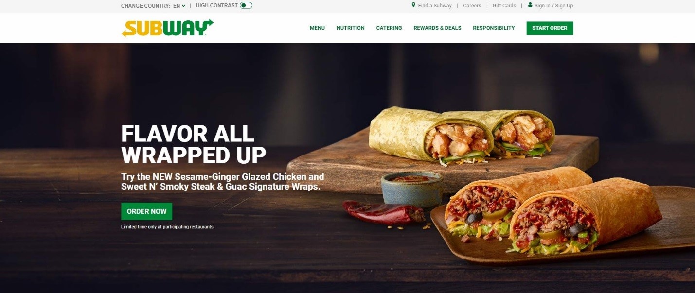
Since the CTA is what you want people to see the most, you have to make it big enough to be noticed. However, avoid going overboard as this may distract the customer from the useful content on the page.
It’s impossible to miss the Subway’s “Order now” button.
Make Buttons Irresistible
Be creative and have a CTA that captivates the audience from the moment they land on your site. Try to make the message irresistible and unique.

Use a Scrolling Call-To-Action (CTA) to Attract Mobile Users
According to Global Web Index, UK mobile users spend an average of 2 hours a day on their mobiles. To target this audience, optimize your button so that it is pinned at the top of the page as the customer scrolls down. That way, they won’t have to scroll back to the top of the page once they are ready to convert.
A Good CTA Should Be Personalized for the Target Audience
By building your customers profiles, you can understand the target audience better and create personalized CTA buttons to convert them. Personalized calls to convert record a 202% better performance than ordinary ones.
Limit Landing Page Text So That the Call to Action Isn’t Lost
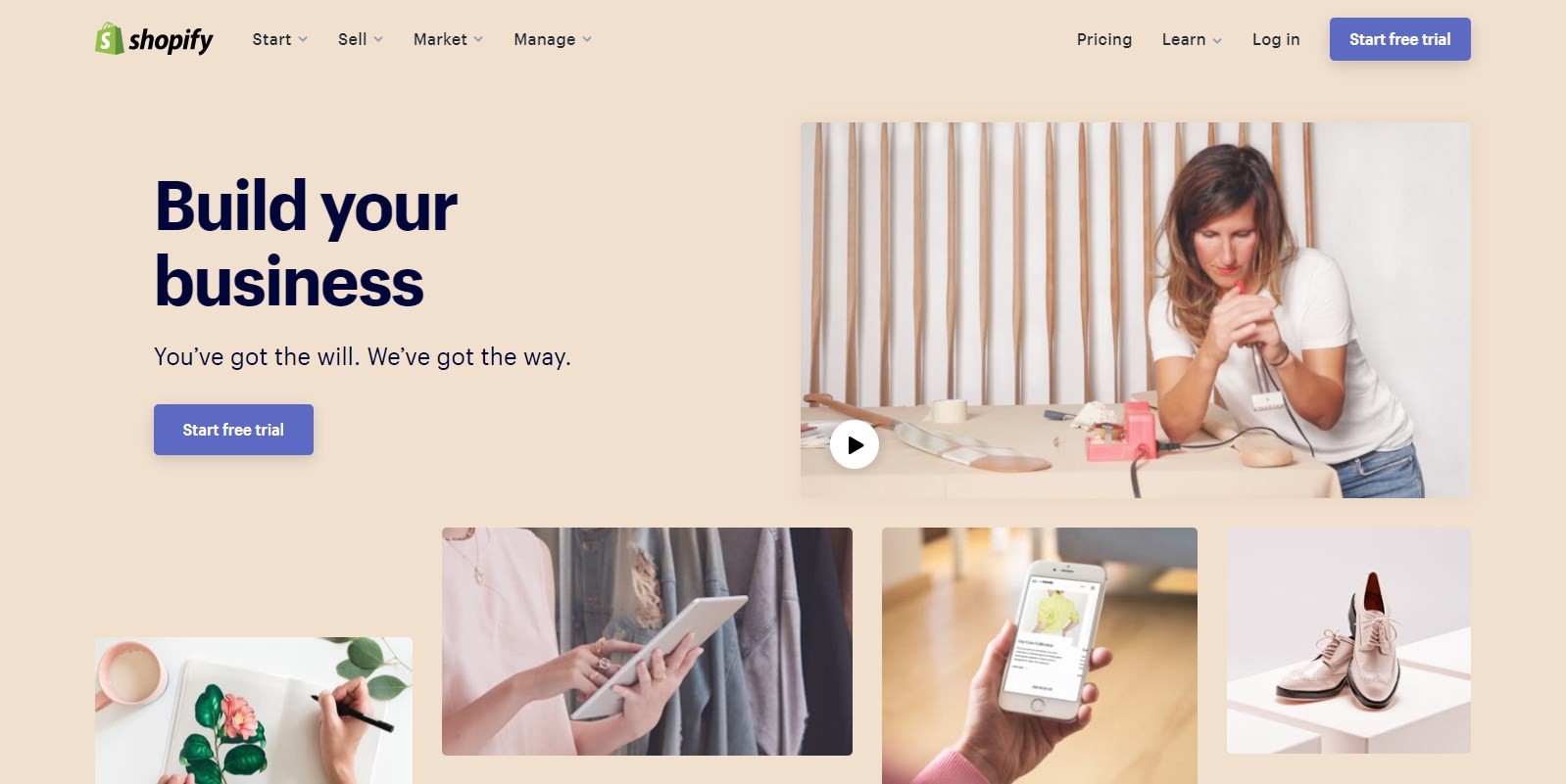
You want to make sure that the call to action stands out. Too much text around it will have the opposite effect, and your CTA will be lost in the content. Simply state how your brand can solve a customer’s problem and then go straight to the CTA. Check out how Shopify has done theirs:
Place the Call Button Strategically
Your conversion button should be in a place where the visitors can easily see it if they want to convert. Avoid locating it below the page fold, on the corner of the page, or right in the middle of the content. When deciding where to place the CTA, consider where customers are likely going to look.
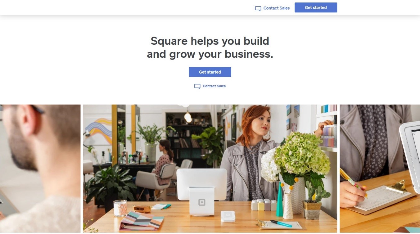
Have Your Call to Action Buttons Higher Up in Text Pages
If you want to place your CTA in the text, think about how the visitors will read the content and place it where it will be seen. The best idea is to place it higher up on the page and closer to the text.
Run Tests on Placement of CTAs on Landing Pages
“About 90% of website visitors who read headlines on a page also read the CTA. Having a powerful and well-placed CTA leads to better customer engagement, growth in site traffic, and ultimately more conversions. If a CTA is not visible, the business will experience multiple leakages in their sales funnel and so, testing your landing page CTA is important.” says Andrew Ortiz, a Marketing Specialist at Skillroads.
Testing your pages and consequently, CTA can help you better identify where a problem comes from and how you can solve it. Here are some ways to make these assessments:
Run a Heatmap on Pages Where the Key CTA Is
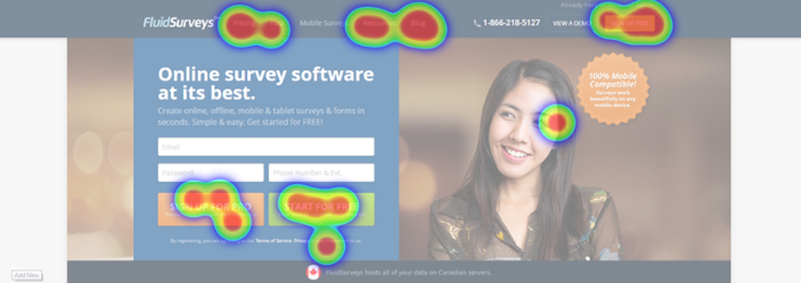
A heatmap report essentially shows the part of the page the majority of leads are engaging with and can help you decide where to place the CTA. So, for example, if the center of the page is white hot and brighter than other places, it means that visitors concentrate on that spot more than other places on the page.
An example of a heat map:
Assess Users Sessions Recordings to Improve Conversion Rate
You can use recordings of customer sessions on your site to understand why you are getting low conversions. This process involves watching how your customers are moving from page to page including where they click or pause.
Conduct A/B Testing to Come Up with CTAs Drive Conversions
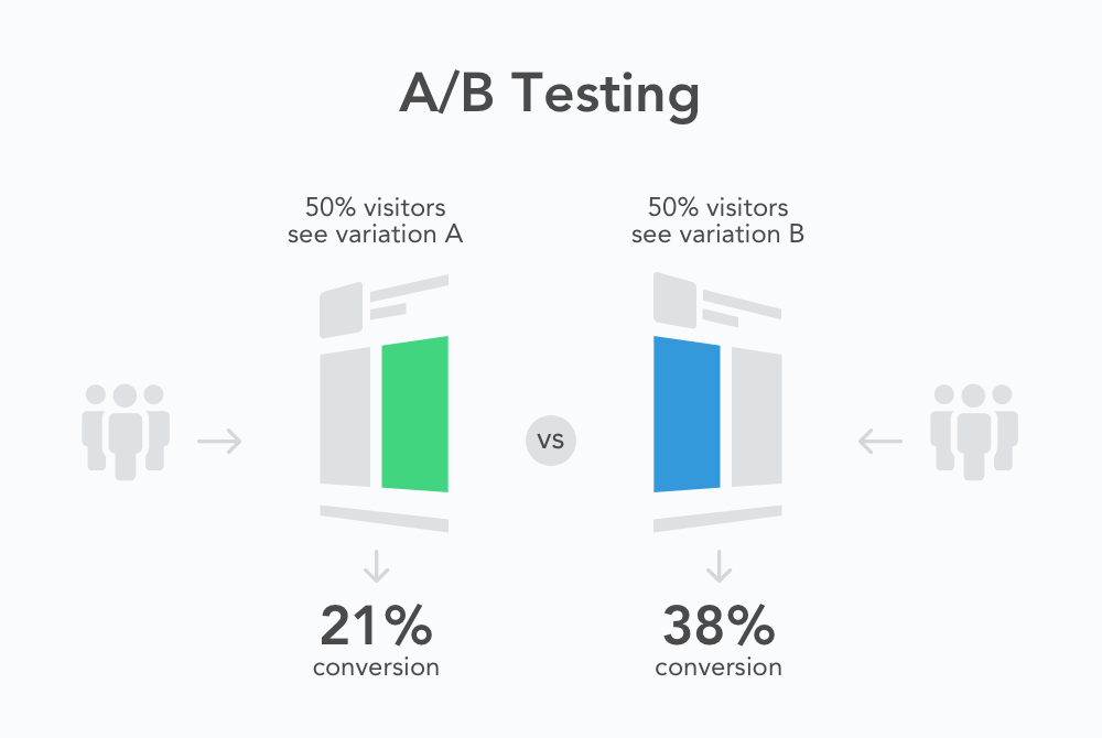
A/B testing simply means comparing two things to figure out which one works best. For example, you can have a site design where you have placed an “add to cart” button on the top right corner, but it is not generating as many clicks. So, you decide to build a new design where you add an image and move the button a little more to the center. Now, you test this new design with the old one to see which one leads to more sales.
Create Alternative Login Options for Conversion Actions
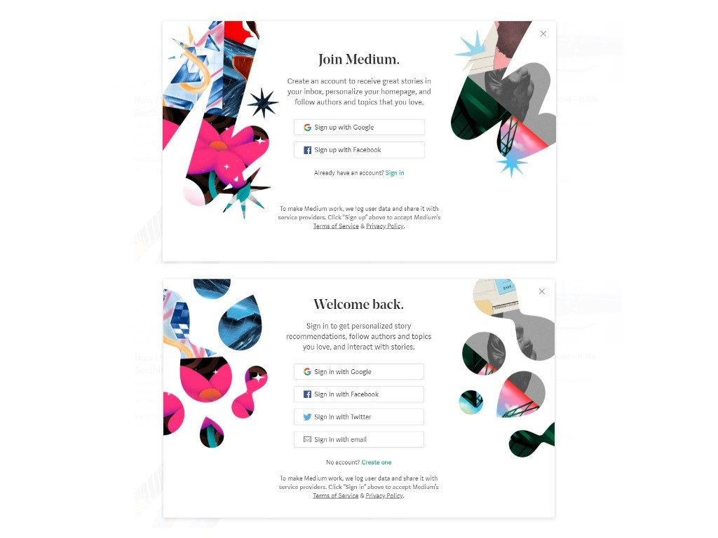
Some customers may be turned off by the need to create an account with your site to convert. Instead, give customers the option to log in with their social accounts. Medium offers a variety of sign up options.
Add a Supporting Statement for an Effective CTA
You may need to make your CTA and page short when creating them for mobile. So, be innovative and create buttons with a supporting sentence to briefly explain what you are offering the customer.
For Landing Pages That Convert, Don’t Duplicate CTA on All Pages
Different pages target buyers at different points in the sales cycle. Therefore, create a button for each page rather than repeating one in all your pages.
Use Just One CTA for Every Good Landing Page
Multiple calls to purchase/subscribe may end up splitting the traffic as each customer takes a different direction. One of CTA best practices is to have just one CTA that is tailored to the message on the page. Then, strategically place it at different points.
Create Unique Good Landing Pages for Each Campaign
Have a unique landing and high-converting CTA for every marketing campaign you run. Most sites, even now, make the mistake of linking ads to their homepage and this has significantly contributed to losing leads.
Add Testimonials to Increase Conversions
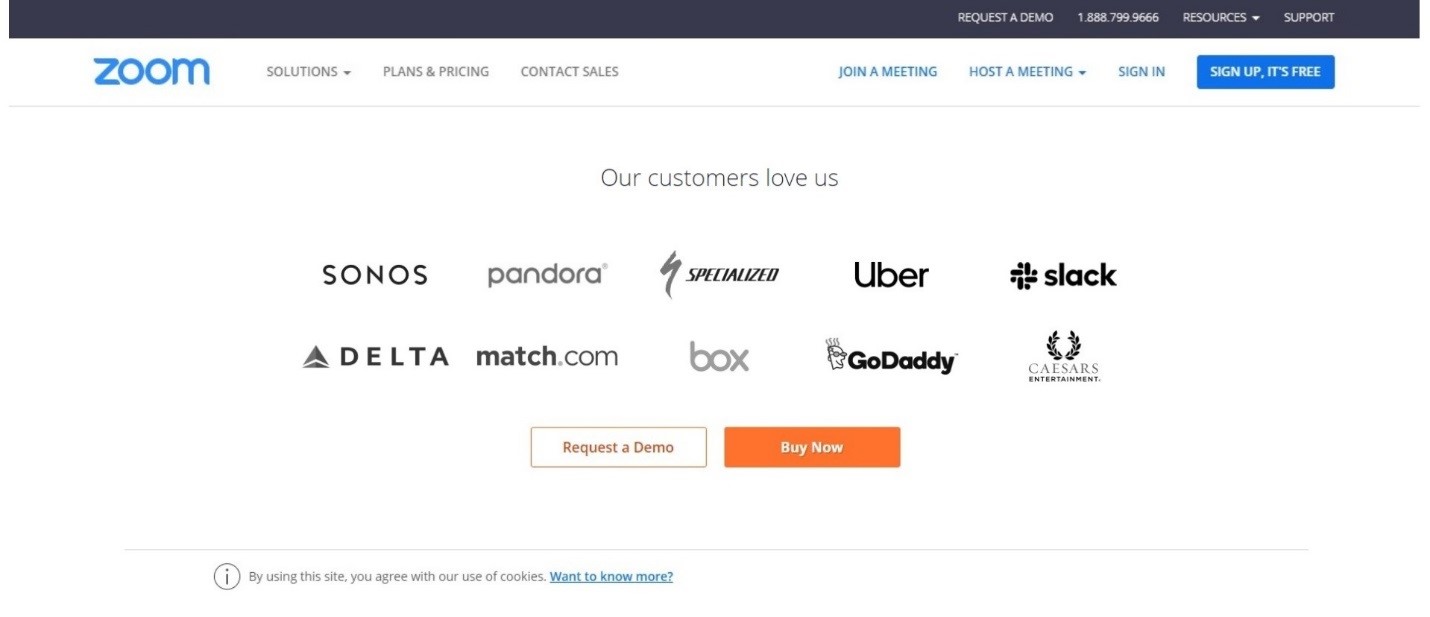
Testimonials from popular brands can do wonders to an e-commerce website. They are effective in convincing the customer to convert. If you don’t have any customer reviews, look for them. Zoom is a good example of a company that lists top brands it has served.
Create Call to Action Buttons That Match Your Ads
Make sure your message on both the ad and the site’s landing is similar. When you generate leads from ads, they expect to find the same promise they found on the advert on your page as well. Else, most of your ad-based leads will leak out. If, for example, your CTA is a brief description of your product and then a “buy now” button, it should ideally lead the customer to the purchasing page and not the homepage or a page where they are to learn more about the product.
Make Checkout Easy for Better Landing Page Conversion
Perhaps one of the most important mobile landing page best practices is making checkout quick and straightforward. According to statistics, about 70% of shopping carts are abandoned at check out. A complicated checking out process is one of the top reasons for this. Simplify the CTA and checkout as much as possible.
Be Transparent Cost-Wise to Improve Conversion Rates
One of the most straightforward formulas for conversions is to be open with prices and accompanying costs. A whopping 55% of abandoned shopping carts are due to high extra charges. So, be open and upfront from the start about shipping and other costs.


