20 Cool Website Design Ideas You Should Check

Since 2016, considering user experiences, we have seen a sharp shift towards great design ideas into UI design. This is probably the most significant change that has taken place in the world of web designing after apps such as Pokémon Go blurred the line between reality and screens. In 2017, web designers have literally come up with creative web designs which were more personalized for users and at the same time, time-saving also.
Here, we have tried to showcase the best of the lot and cool website design ideas which you should check out and implement to rick ahead in 2018.
The Best of 20 Cool Website Ideas for You
#1. Cinemagraphs
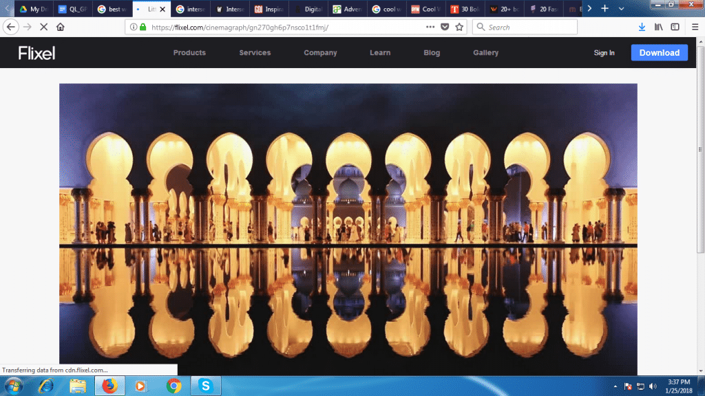
Cinemagraphs have beautiful photos with elements having repeated movements. The main attraction point is its visual appeal. Anyone will stay for more than 10 seconds at least on such type of landing page. How cool! Basically, Cinemagraphs can either be GIF files or video.
#2. Australian Design Studio
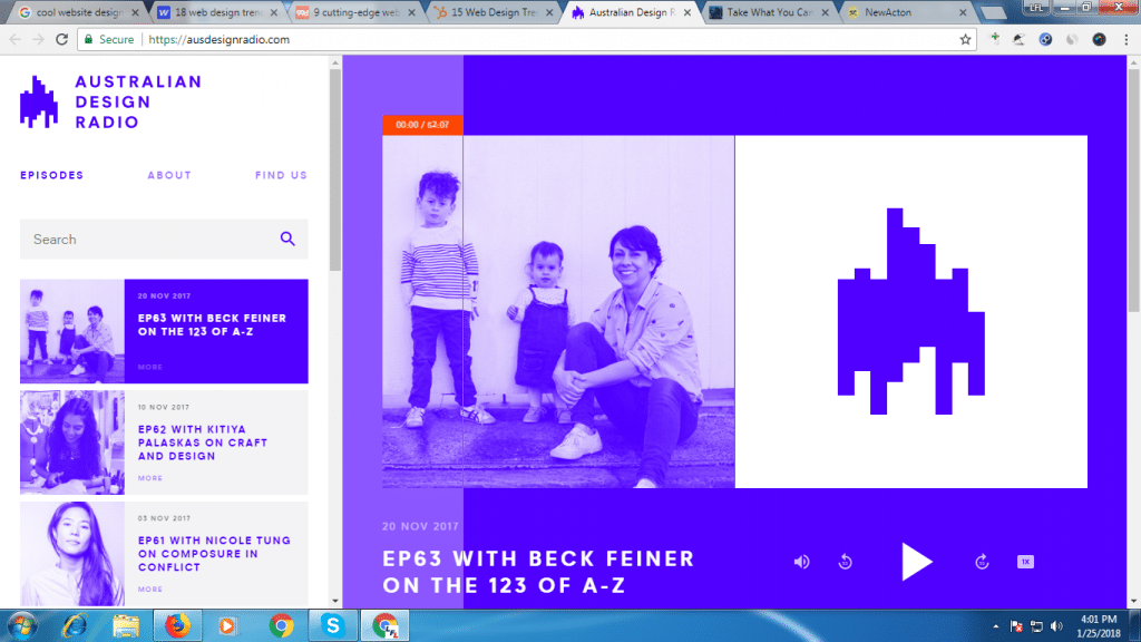
Look at this cool website design. Here, the designer has used pared-down, two-tone colour scheme. It not only looks cool to the eyes but also gives a contemporary feel.
#3. Adventure Park
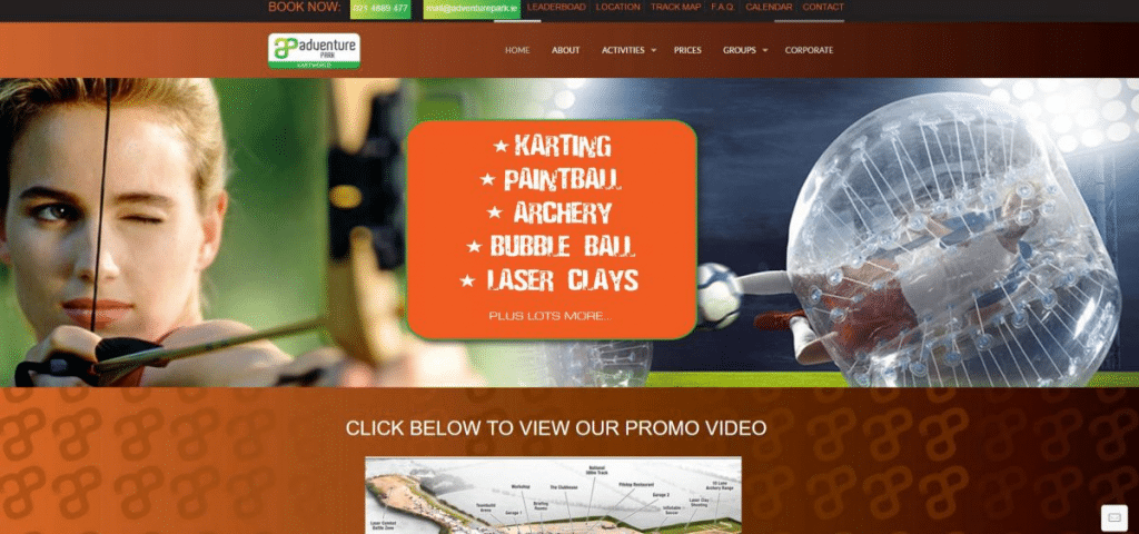
This particular website design is an intricate dance between design and execution. Huge graphics and minimal text clearly convey what all a website is about.
#4. Pound and Grain
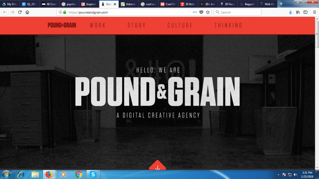
This design focuses on brand name and the image content is provided in the background. There is no overdoing of colour combinations. Minimal colours help users in staying on the web page for a long time since they don’t get distracted by too many flashes of contrast colours.
#5. MIQL
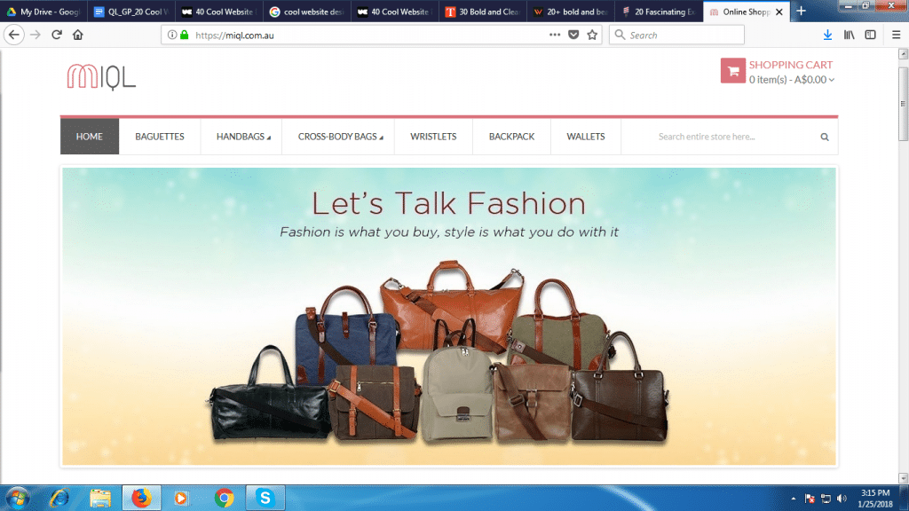
Rather than having haywire graphics, present them in such a way that they lend visual variety and appeal. Otherwise, your web page gives an impression of a boring page of text. Here, in spite of being an e-commerce store, graphics are not overloaded (it also helps the loading speed) and more clean space ensure that content is written in line with the context.
#6. Robby Leonardi Studio
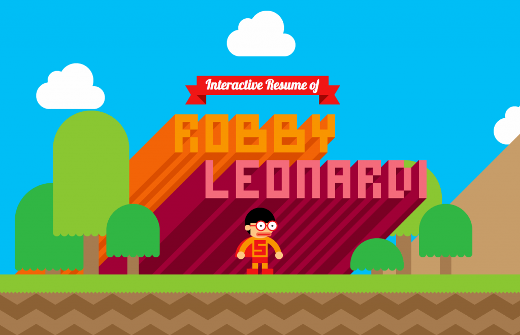
Typography is equally important as graphics. These days’ twisted retro designs are trending. This “interactive resume of Robby Leonardi” is a brilliant example of modern retro. A twisted i.e. modern retro design takes care of pixel art, vintage typography or 80s and 90s inspired imagery.
#7. Take What You Can Carry
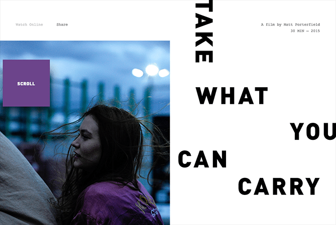
This is for sure not to miss a cool website design. The entire text floats in such a way that it leaves a good amount of free space. What a breathtaking alignment of words! On a very simple webpage, this design of director Matt Porterfield blends horizontal and vertical text alignments.
#8. Pink Turkey
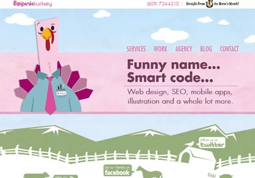
A good website design is a design that dictates information using 2 or 3 eye-pleasing colours that blend well and create a proper tone or mood for your business. This is the classic example of a cool website design.
#9. Cat Scarf
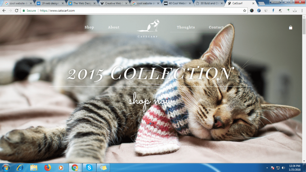
As the name suggests, they have given visual appeal to their homepage. Whosoever will land up on this home page, will, for sure, remember brand name – all thanks to intelligent graphics. They have featured a big snap of a pretty suave-looking cat wearing a cat scarf. Moreover, the perfect placement of CTA is a plus for this website design.
#10. New Acton
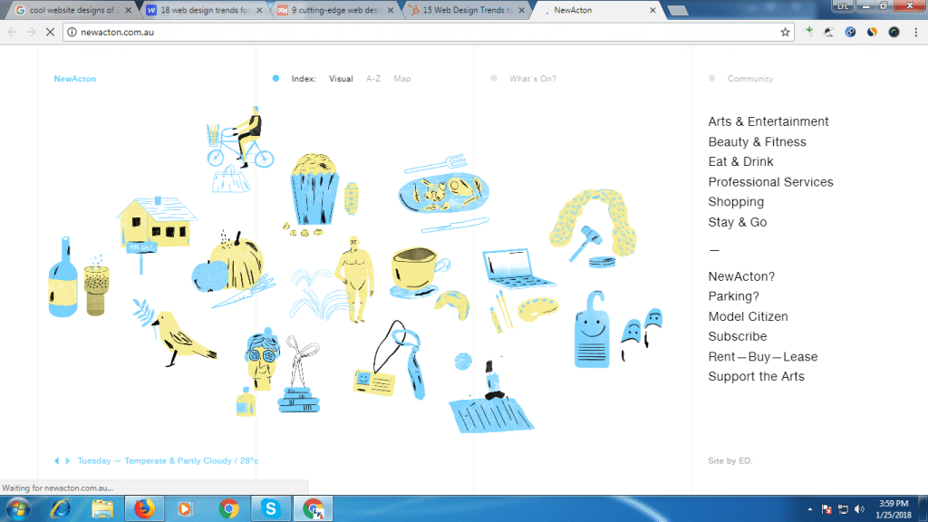
If you are tired of your years’ old static design, go for illustrators and graphic artists to create bespoke illustrations for your websites. See how New Acton has added exemplified touches to their website to augment their online personality.
#11. GC Watches
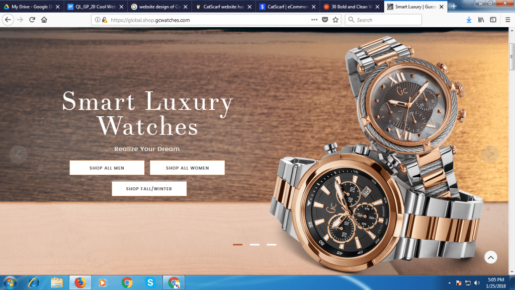
If you want your customers to directly visit your product pages, this is the design you should straightaway adopt. See how GC Watches is presenting you with a timeless design: clearly visible copy next to bold and bright images.
#12. HTML 5Lab
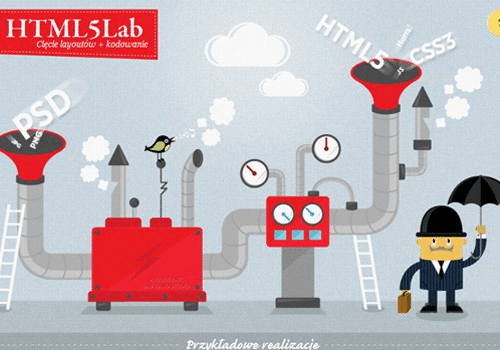
No one in this world has time to sit in front of computer screens to read lengthy content and understand what you do. Hence, your website should be designed in such a way that web content should convey the message straight in seconds. This is the best example of “straight message”.
#13. Britney Spears
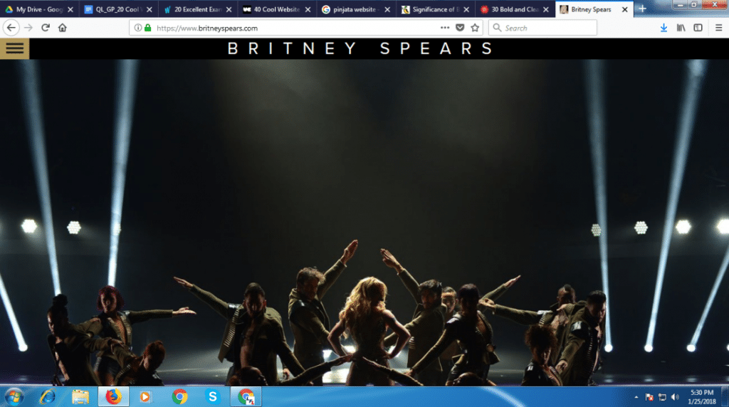
Britney Spears is not a new name for anyone. Her website is equally unique as her personality. Here, website designers have nailed it with a high-quality graphics and just her name; of course, her personal brand doesn’t need more introductions.
#14. Big Commerce
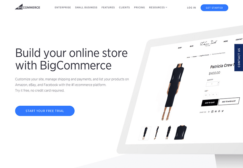
Another one in this list of 20 cool website designs is BigCommerce. It is a flexible and robust eCommerce platform. BigCommerce provides both emerging and established brands with all their requirements they need to launch, manage, promote, and scale a flourishing online store.
#15. Nike90 Store
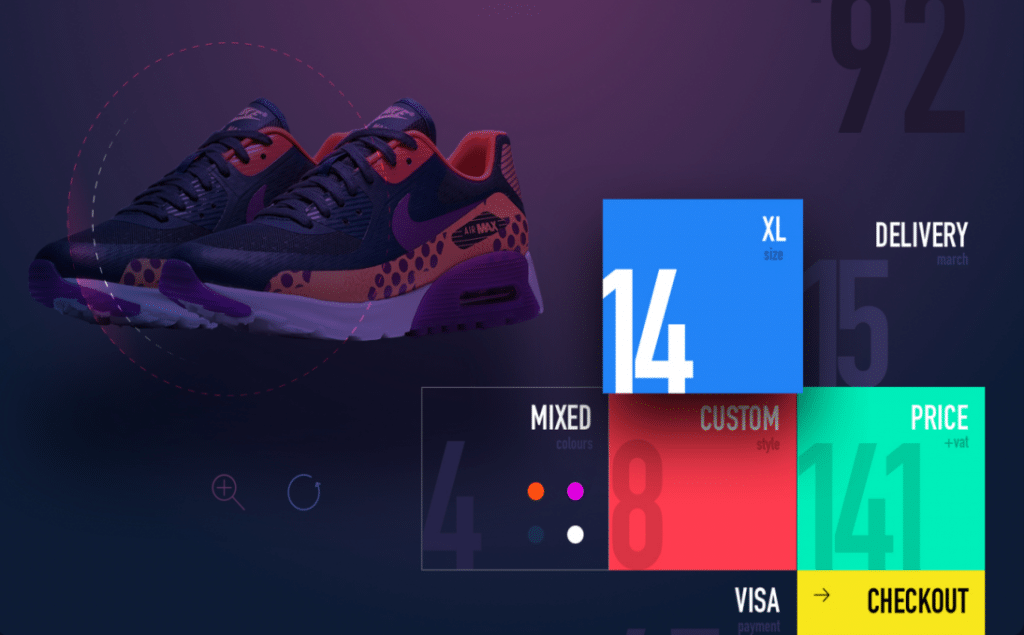
One of the growing cool website designs is welcoming diffusing shadows. Perhaps it’s the time to wave goodbye to long shadow. Look at the eye-grabbing design of Nike90 Store. Here, the design itself speaks volumes.
#16. Pocket
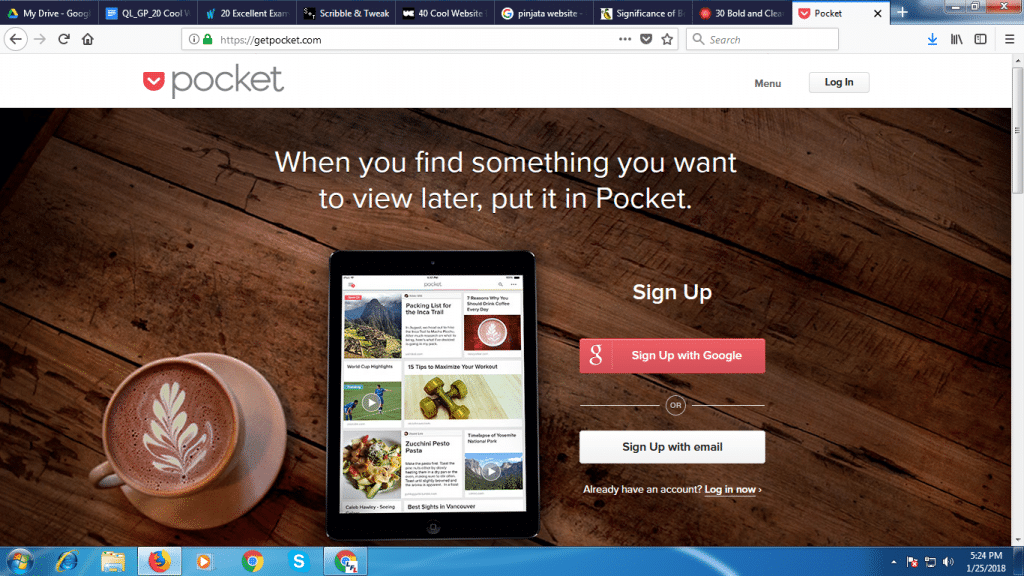
Opposites attract for Pocket, a content marketing tool, uses a clean, white font on a natural wood grain background. Easy to read, easy to understand and easy to sign up! What else a business needs?
#17. Ibbleobble
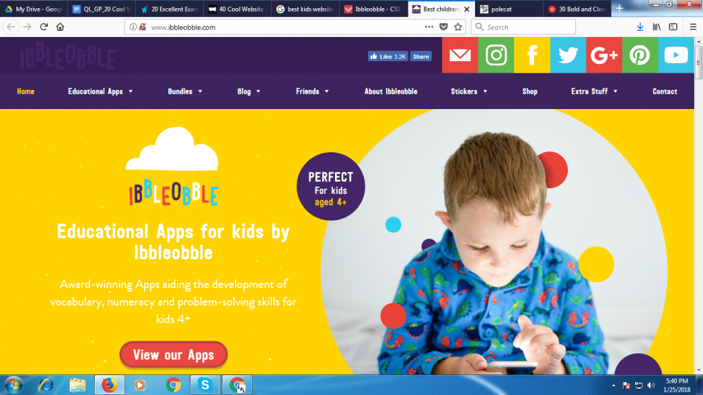
Here, website designers have left no stone unturned in designing a beautiful website for educational apps. Background colours keep changing with animations to make content more legible.
#18. Godotmedia
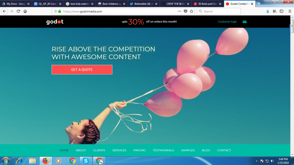
This neat looking is a stunning website with a professional look. In such designs, you can quickly get your visitors attention by showcasing a big message, followed by a non-salesy CTA.
#19. Keep SA real
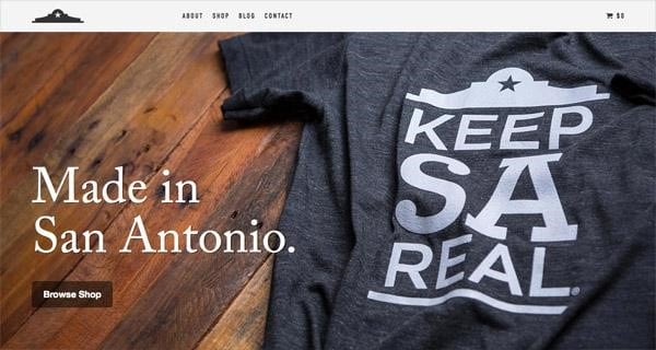
If you are in the apparel industry, this can be the best choice for you. The site delivers a full-screen layout with a high-quality image. The large heading and the shop button are displayed in a visible manner to make it more accessible. Greatly taken care of CRO principles too!
#20. Howard Yount
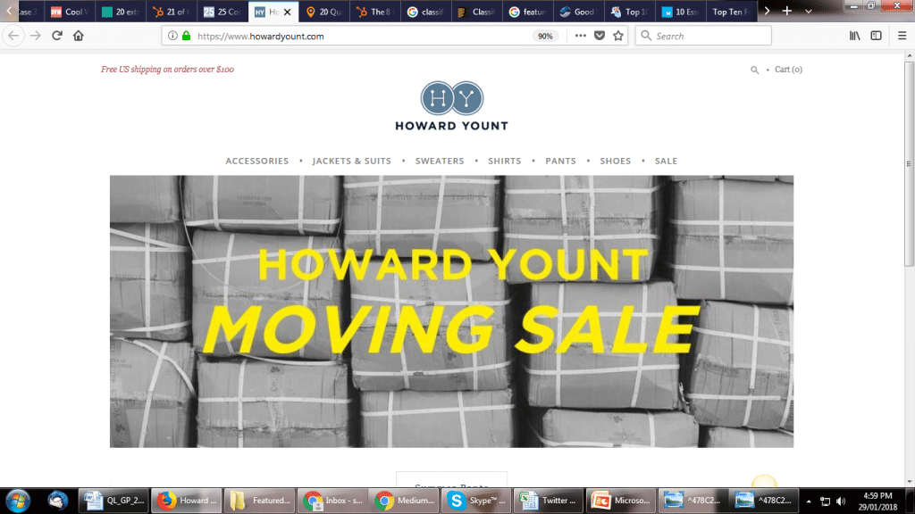
Three awesome combinations – An eye-catching background, large title, and engaging message; this is what a user needs to get interested in your offerings. The overall design is quite simple yet effective.
Closing Thoughts
Since it’s tough to find website designers that have quality standards, we have tried to curate the bests of various 20 examples of cool website designs for you. As you would know, an unattractive or poorly constructed website will hurt more your business than to help it. Take a look at your industry trends and follow all CRO principles to come up with the best website design for you. Evaluate the effectiveness of your website design on the basis of the number of visitors, bounce rates, and conversions.
Raj Gautam
Latest posts by Raj Gautam (see all)
- 20 Cool Website Design Ideas You Should Check - February 21, 2018


