How to Design Your Service Page to Turn Visitors into Converts?
Marketing a product can be challenging enough in today’s world, but marketing a service is another ball game. Websites selling products have to worry about making the site easy to view and simple to skim through, which (when looking at a site like Amazon) allows products to sell themselves.

Instead of focusing your efforts on creating sales, you’ll need to spend that effort on creating leads. The trick? After managing to rank your new website, make sure to design your service page in a way that draws visitors in without going over the top. Here’s how it’s done.
Design Your Service Page – Subtle Motion
If a client likes your services, chances are they’re coming back for more. Instead of pressuring potential customers into buying your service like you would, a product, you’re going to let the service speak for itself.
On average, it takes about seven contacts before a website viewer turns into a sale. That won’t always be the case, of course, but it’s the number you want to keep in mind as you design your service page.
During those seven contacts, your site’s goal is to feature links that casually catch the viewer’s eye. There should be a list of services or facets of one particular service if that’s all you offer, somewhere on the front page. However, the imagery needs to lead the eye there before a click is going to take place.
This is the flow of your page, and the flow you want is subtle motion. In other words, a subtle call to action. Words such as “to find out more” or “contact an agent” prove to be strong CTAs, which you can implement in an unobtrusive manner.

Design Your Service Page – Subtle Design
Why are sites like Facebook and Instagram so popular? They feature a bunch of flashy pictures, moving gifs, and colorful schemes. They’re also explicitly designed to be entertaining, which isn’t what you want to go for when you design your service page.
Visitors are going to consider your business unprofessional and look elsewhere if your page is messy. Whether your site runs like lightning or not, it’s also going to remind visitors of spammy, ad riddles websites that clog up their browser and eat up their bandwidth.
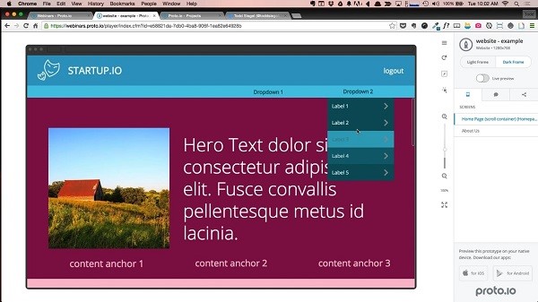
Clear your service page up by including a menu that’s easy to navigate and including plenty of white space. The site you’re reading this article on makes great use of both.

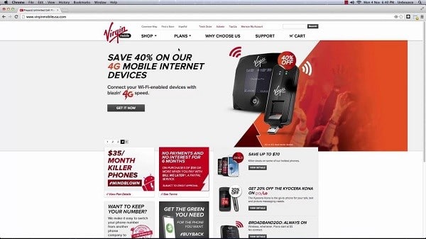
You’ll want to make sure your services are above the fold as well, or the top half of your page. Why? People skim read more than they actually read, which means you’ll only have their full attention for so long.
Design Your Service Page – Responsiveness
This one is simple. You’re more likely to create leads when your website can be viewed across multiple devices. Unfortunately, sites never come instantly translatable to smartphones and tablets.

With the trend in mobile internet usage only increasing, this is essential to your success. If you’re lucky, you either know how to do this yourself or the company that hosts your site offers a useful widget.
If neither of those are the case, you might have to collaborate with a web designer. Which brings us to the last piece of advice on how to design your service page.
Design Your Service Page – Collaborate
If designing a responsive website, or any other part of designing your service page, is a challenge that you simply do not have the skill set to tackle, then you’ll want to hire an expert.
Choosing to collaborate with a web design chorley agency ensures that your site generates leads. They know popular website trends, what background will look best, how to make you CTAs subtle yet effective, etc., which takes a lot of weight off of your shoulders.
For instance, if you didn’t know what above the fold meant earlier, then site-specific terms are one less thing you’ll have to worry about. You might not be sure where the links on your site should go but a web designer knows these kind of things like the back of their hand.
By combining their tech knowledge with your knowledge of the market your services reside in and your type of customer, the two of you can make a service page that stands out from the competition while turning leads into sales. Working with a web designer doesn’t mean they take your site over, it just means they’ll tackle the end that you aren’t able to.
All Things Considered
Just to recap the main points, as you design your service page you want to:
- Keep a subtle motion and subtle CTAs
- Avoid flashiness and keep your design equally as subtle
- Make sure the page and site are responsive
- And collaborate with a web designer when you need to
Wendy Dessler
Latest posts by Wendy Dessler (see all)
- 5 Basic Steps to Keep in Mind When Developing Brand Identity - January 13, 2018
- How to Design Your Service Page to Turn Visitors into Converts? - November 15, 2017


