Colour Psychology 101 – How to Design Your Website
Colours are used everywhere, and there’s a good reason for it. Colour, believe it or not, can affect the way we perceive things, the way we feel, and even our mood. Whilst colours are subjective to personal preference, research shows that consumers make a decision whether or not to buy a product in just 90 seconds, of which up to 90% of their decision is based on a particular colour.

Understandably, the content on your website is important, but have you ever thought about how the colour of your pages, text, CTA buttons etc. could affect your users? The way in which you design your website could be far more effective than you might think; designing it to your own personal preferences may seem like the logical option and undoubtedly is hard to avoid, however, this may not be the right way.
We’re going to dig right down to the core of what colours mean to your website users, how to design your website to include the right elements, and investigate how colours can affect your website conversions.
The Various Colours Discussed
Yellow

Yellow is often related to happiness, triggering friendly, optimistic, and content emotions. If you’re looking to invoke a bright and happy response from your users, yellow is a great colour choice for your website, but you don’t want to overdo it. A splash of yellow, or yellow flowers (if you’re going for a sunny outdoors feel) will make your users feel intrigued and energized.
As yellow is a naturally bright colour on its own, it can be used for a certain call to action (CTA) buttons to pop out at your users. However, avoid using yellow text, even if it’s on a black background, yellow text is hard to read and you only really want to include it on buttons or within images.
Red

Adding a sense of urgency or passion, red is usually a colour related to warning signs to grab your attention. When using red on a website, you ideally want to use it sparingly; too much red can be overwhelming, but when used in the right places, can draw your users’ attention where it’s needed.
If you want your users to notice a sale or an offer, red is a great choice as it’s striking and noteworthy. Red, combined with other colours, can add an element of boldness and confidence, but keep in the back of your mind that red gets the heart racing, so you don’t want to scare off your users!
Green

Often seen when relating to health, vitality, and nature, green adds a sense of calm and harmony in people’s emotions. As green is a soothing colour, it’s not one to use if you want something to stand out, but can be used in many different design scenarios.
Green, again, shouldn’t be used as a colour for text as it can be hard to read against coloured (or black and white) backgrounds. Green is commonly related to positivity, in life, nature, and numbers. Many finance related websites use the colour green to represent values and figures as it has prosperous connotations
Black

Black is an interesting colour as it represents a lack of colour, but is right at the top end of versatility. Black invokes serious, bold, and powerful emotions, and can be used on many websites as an element to draw attention.
Too much black can lead to negative emotions, so use it sparingly and in the right places. Many clothing and luxury brands, including cars, make use of the colour black on their websites, as well as technology. It’s a clear colour that is often used as a background to make other colours stand out.
White

A complete sense of serenity, white is the definition of purity, simplicity, and perfection. White is a very common and popular choice for websites as you can’t go too far wrong with the colour; many other colours stand out stunningly on a white background.
Of course, too much white can be boring, but you can use it on your website as a place to start, adding other colour elements to it to provide pure class and sophistication.
Colour Blindness
Now that we’ve covered a range of colours and how they affect people’s emotions, we want to draw your attention to something that many people don’t consider when designing a website – colour blindness. Colour blindness does not mean you are physically blind to certain colours, it relates to the way you see colours differently from others. More commonly reported in men, colour blindness mostly applies to blue, red, green, and yellow colours.

Source: All About Vision
In the majority of cases, colour blindness causes people to see colours differently than others, as can be seen in the image above. Therefore, it is important when designing your website to consider how colours can appear to other people.
For example, if you were to use a yellow background with a red font, someone with colour blindness will likely not be able to see the text at all. Whereas if you were to use a black background with red or green text, even if the user is colour blind, they will still be able to distinguish the text, rather than it being washed out.
User Preferences
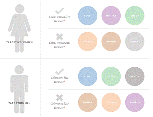
This is a tough nut to crack because in all honesty, everyone sees colour differently, depending on the mood they are in, the way they visualise things, etc. However, research shows there is a gender-specific common theme based on sociological differences.

Source: Kissmetrics.com – Psychology of Color and Conversions
Designing your website should be centred around your target audience, so don’t be afraid to do your research – after all, research is invaluable in increasing your conversions. Many website builders, like WordPress, offer thousands of website templates for you to choose from, and are often categorised for easy navigation. But, the navigation isn’t just for your benefit, it’s also for your users.
You’ll notice a common colour theme between certain categories, for example, health and beauty, and nature-based themes will follow a similar colour scheme – that’s because when they’ve been designed and developed, they have been done so in a way to attract users to your website, and therefore convert them. Choose a website builder to start with to get an idea on the types of styles that you could use for your website, categorised by type and industry; it’s a great place to start to generate creativity and add a sense of how to target your chosen audience.
Call to Action
A call to action should draw your website users’ attention directly to it, so naturally, those that are going to spot your CTA buttons are going to because they are bright, bold, and colourful. Common colours are yellow, red, and green and present a higher conversion rate compared to duller or dark colours like black, grey, and brown.
Amazon is one of the biggest online retailers in the world; we wouldn’t necessarily say that their website was stunning or the most attractive design we’ve ever seen, but they do use colour correctly in order to convert users.
![]()

The buttons and information they want users to see are bright, easily definable, and pop out to the user, encouraging them to read further and purchase. eBay is another great example of a website that uses bright and bold CTA buttons, always drawing the user’s attention to them by opting for contrasting colours that stand out.
 How to Design Your Website
Designing your website can be a bit of trial and error, but first and foremost (as we’ve already said) you must ascertain who your target audience is, and you need to ask yourself a few questions:
- What message are you trying to get across to your users?
- Do you want your logo to define your company?
- Do I let my web designer pick the colours?
There needs to be a starting point for everything, and that point may not always be correct, but it can be used as an invaluable learning curve. Don’t be afraid to change your personal or business website colours if they’re not working; ask your users for feedback, and listen to the changes that your target audience wants from you. As well as learning what your users want, you’re also building up a network of engagement and trust with them, urging them to come back for more.
Once you’ve decided how you want your website to look, try and stick with a common theme across your logo, website, and social media platforms – consistency is key. If your logo has green in it, try and use the same colour in various different places on your website; take your mind back to those home design TV programs where the cushions have colours to match the walls.
With all the talk about colour, it can be easy to forget white space, which can often be a saving grace when it comes to website design. If your website is looking cluttered, or you’re struggling to make your content stand out, white should be a definite consideration. Take a look at Google for example:

Their homepage is almost entirely whitespace, with only their logo and CTA button in colour. But guess what, those colours mean something to their users – they’re bright, colourful, and in all honestly are simple. There’s nothing else to it, yet literally billions of users are visiting this site every single day.
The simplest tip we can give you is to stand back from your own website; don’t choose colours and themes that just look nice – of course, your website should look great, but colours invoke a psychological response. Use colours wisely and in the right places, and you’ll increase your conversion rate. Use them incorrectly and you could be damaging your potential sales before you’ve even begun.
Jann
Latest posts by Jann (see all)
- [Infographic] 15 Fascinating Website & UX Stats for 2018 - February 6, 2019
- Colour Psychology 101 – How to Design Your Website - February 26, 2018


