Mastering the Art of the Perfect Business Presentation in 7 Easy Steps
It can be one of the most daunting prospects of any job role. Presenting information to others in a presentation requires a level of confidence, assertiveness, and organization skills that many of us don’t know we have–but with the right considerations, we can master the art of being the perfect presentation host.
Whether you’re presenting data to your team, summarizing a project for managers, or attempting to win over prospective clients, all presentations deserve the right level of commitment and care.
Although it can be hard to work on building your confidence when speaking in front of audiences, one of the best ways to manage your nerves is to be well equipped with an inspiring presentation. With this in mind, let’s take a deeper look at how you can captivate your audience and present your points, hypothesis, and findings clearly:
Determine Your Goals as a Priority
The first thing that you should consider is the goals that you’re aiming to achieve through the power of your presentation. By breaking down what you’re aiming to achieve, you can arrange your slides to accompany each stage in achieving each goal–or build them to help lead the audience to the right conclusion.
By defining and working towards your goals, you can provide the presentation with some much-needed direction. Regardless of whether you’re developing a business plan, pitching a new product launch, or simply reporting the month’s financial results, goals mean you can place yourself firmly in control of your own narrative.
Construct a Presentation Storyboard
Structure is crucial to a coherent presentation. With this in mind, you should gather the relevant information that you’re using to support your slides and allocate them to each slide respectively. This will help you in supporting the goals laid out for each stage of your presentation.
By creating a storyboard, you can also mitigate the risk of throwing important facts and figures aimlessly into slides without a sufficient introduction. Likewise, you can avoid the risk of pasting data slide by slide in a presentation that’s unfocused and too long.
Impressions Always Matter
If you think your data and slide content can do the talking for you when it comes to presentations, you’re wrong. Plain and simple.
There’s a reason why you’re presenting information or findings to others rather than emailing them. This is your chance to achieve your goals in a visually stimulating format that can keep audiences engaged for longer.
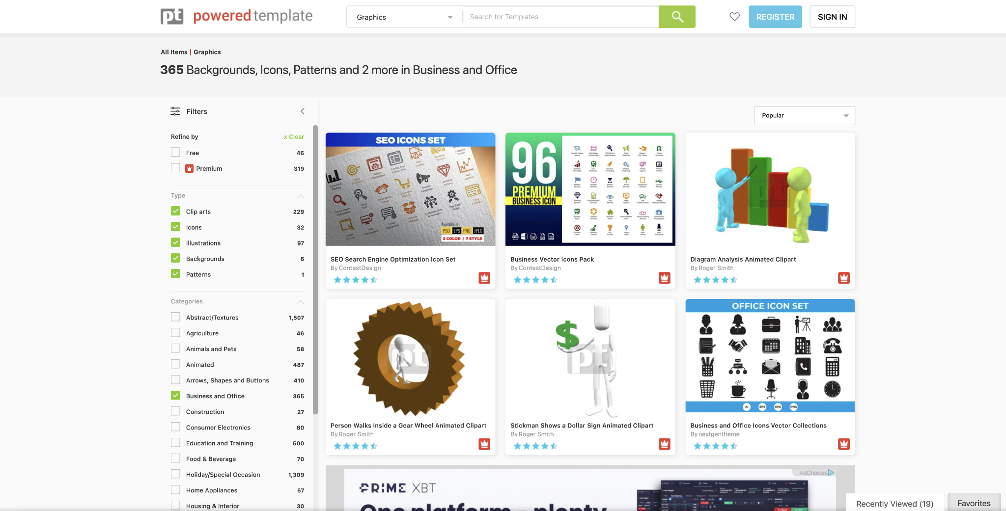
With this in mind, it’s imperative that you care for the appearance of your slides. To help accomplish this, it’s possible to utilize specialist resources like Powered Template, which offers up expertly designed graphics and templates that can be utilized to present information.

Powered Template’s intuitive menu can help users to build visually engaging presentations through its suite of graphics and clip arts that command attention.
Through these resources, it’s possible to create a strong and recognizable theme within your slides that can help to draw your audience in. The right use of graphics and illustrations can also help you to emphasize your point in a more aesthetically pleasing manner.
Through Powered Template’s range of more than 100,000 visual resources, you can thrive in creating a presentation that helps you to achieve your goals.
Adopt a Professional Design
Another key component of presentation anxiety comes from individuals struggling to come to terms with the design element of their slides. In a format where first impressions are everything, it’s essential that your slides are visually appealing throughout and that the format is consistent to avoid loss of interest or confusion.
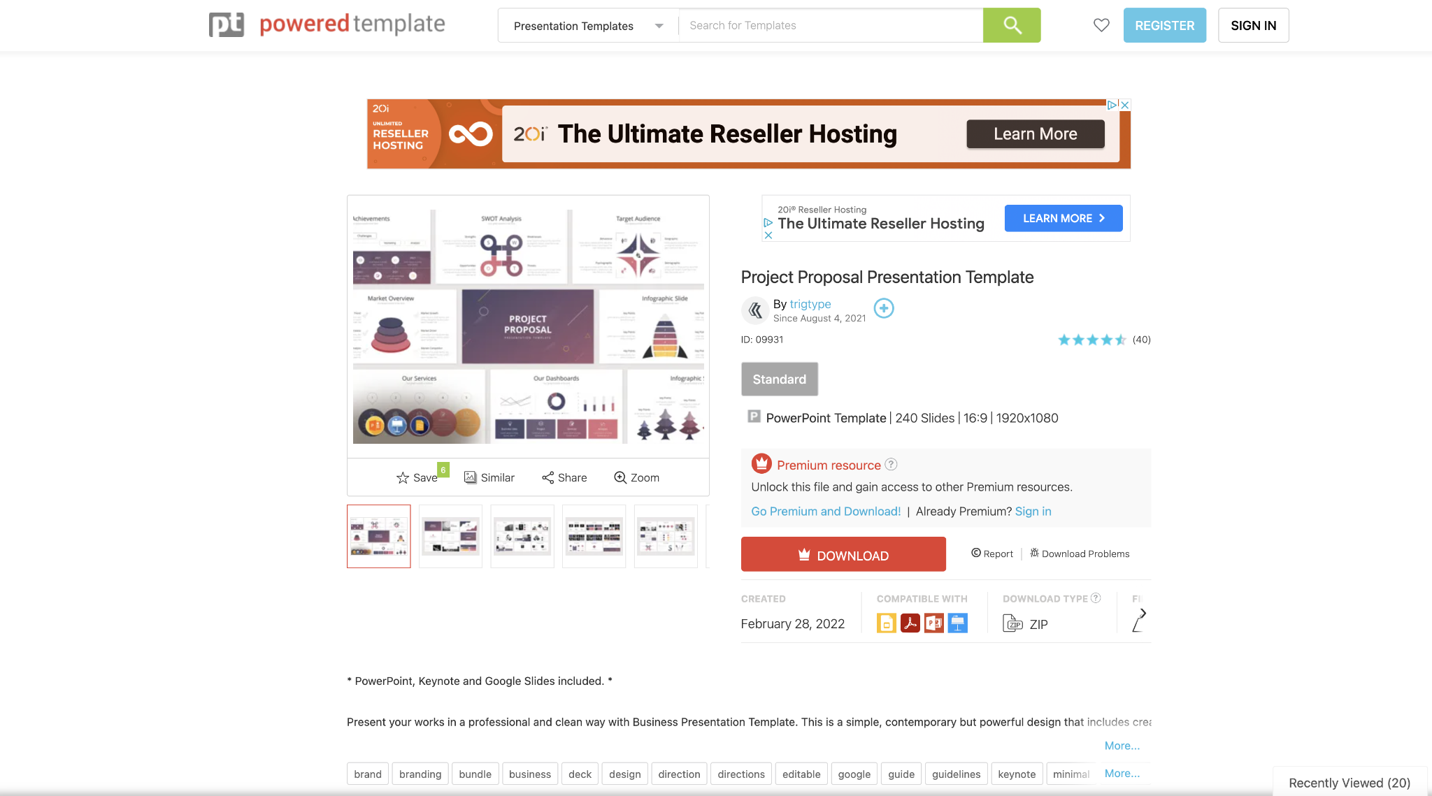
With this in mind, Powered Template once again excels at offering users professionally designed slide templates that suit a vast range of business purposes.
These templates, which are 100% editable and professionally created, can suit the needs of any presenters, and can house complex datasets and business plans in an effective manner.

As we can see in the example above, these templates can come with plenty of variations that can support all different manner of data and findings. These consistent themes allow users to create slides that audiences can enjoy and quickly familiarize themselves with.
With prices starting at $9.95 per month, or $24.95 for an on-demand yearly service, it’s easier than ever to gain access to Powered Template’s vast library of impactful presentation designs. For users who would prefer to make presentations in a more cost-effective way, there are thousands of free-to-use options on site too–albeit with a visible attribution required on the final content.
Always Obey the 10-20-30 Rule
If you’re struggling with how to structure your presentation, the 10-20-30 rule is a great place to start. This rule stipulates that presentations should consist of no more than 10 slides to compress information in a digestible format, last no more than 20 minutes to accommodate the average attention-span of the audience, and be delivered in a font size of 30 points to make sure all data is readable to everyone.
This format is naturally open to interpretation based on who you’re presenting to and how, but as a rule of thumb, it’s a great way of gaining an idea of how you should shape your content and set up your information.
Master Your Opening and the Rest will Follow
The opening of your presentation will make or break your whole effort. This is because humans can be fickle, and if they don’t find themselves hooked within the opening couple of minutes, they’re likely to switch off as you progress.
There are many ways to ensure that you can command the attention of your audience when you start your presentation, including:
- Summarize your points in an opening slide
- Create a storytelling narrative to appeal on a personal level
- Go for drama and grab interest with a bold statement
While these approaches don’t have to be essential practice, you’ll need to ensure that your audience is tuning into what you have to say and isn’t simply thinking about what they want for lunch.
Save Some Data Points for Your Q&A
Always remember that you’ll have a Q&A session following your presentation. For this reason, it’s important to avoid the temptation of cramming as much data as possible into your slides and instead saving your more non-essential points for after.
This can be highly beneficial for a number of reasons. Firstly, your non-essential data won’t distract the audience from the key points you’re making, and secondly, it can make you appear far more resourceful when it comes to answering questions from the audience.
Although pre-presentation nerves can be hard to manage, you can build your confidence effectively by setting up a winning presentation from the off that answers many of the key goals of your task. This can help to free your mind to focus on speaking about the information, rather than worrying about whether people are following the points you’re making on screen.
Chandni Panjwani
Latest posts by Chandni Panjwani (see all)
- 10 Examples of Great Copywriting in an E-Commerce Store - December 18, 2023
- Crafting A Memorable Brand: The Importance Of Mockups - December 6, 2023
- Navigating the Digital Landscape: Strategies for a Robust Online Marketing Presence - November 21, 2023


