The Best Performing Opt-in Forms of 2018
There’s no doubt that email is one of the most profitable channels for online businesses. In fact, according to the National Client Email Report by the DMA, email earns nearly $4 for every $1 invested in it.
With an ROI like that, it’s important to have a good email strategy in place. And that starts with building a quality email list.
Many online businesses and retailers go for opt-in forms to capture emails from visitors on their sites. However, not all opt-in forms are created equal, and it’s important to look at the data to know if you’re following the best practices.
Omnisend – ecommerce email marketing solution – analyzes their customers’ data and launches reports every year. At the end of 2018, it was the data from over 7200 brands, mostly from the United States, the United Kingdom, and other English speaking countries.
The e-commerce email marketing infographic reveals the insights on promotional newsletters, automated emails, Black Friday promotions as well as list building means.
Let’s take a closer look at Omnisend findings regarding opt-in forms. Which form has been shining the brightest?
The Key Findings:
- A few different types of opt-in forms perform better than only of one type.
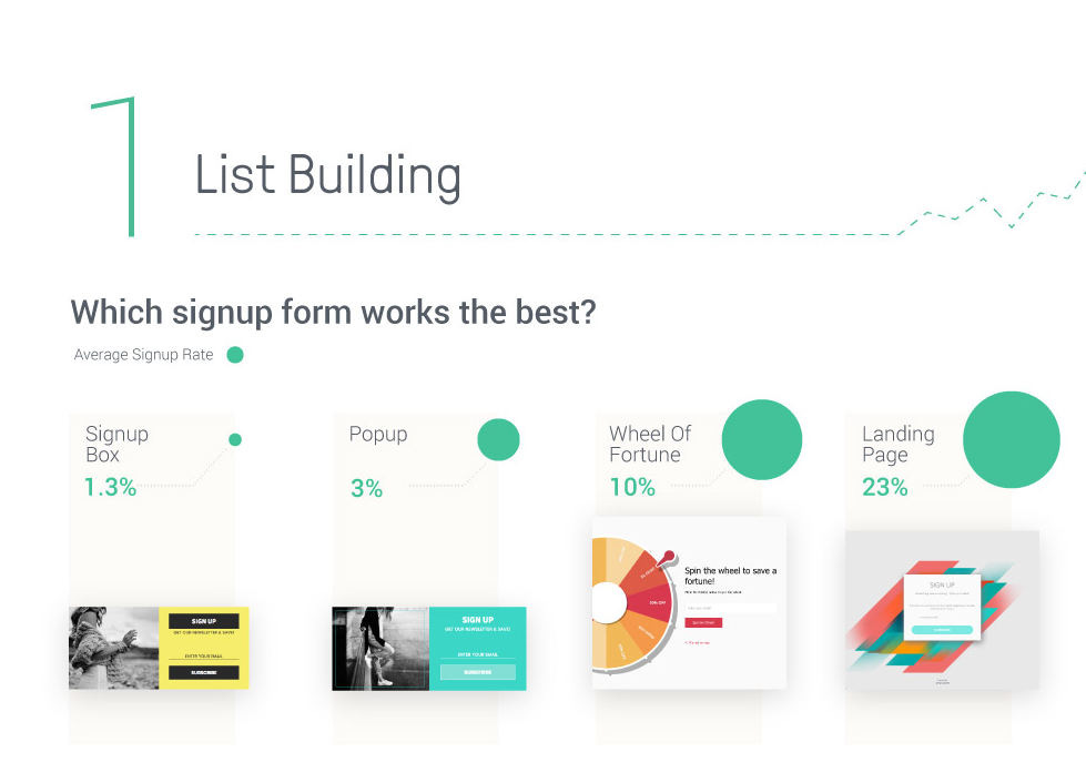
- Pro-active opt-in forms like popups work almost 3x better than passive forms that you can find at the bottom of the page.
- By using only a single popup on your website, you can expect about 3% of signup rate.
- The best signup rate can be reached with landing pages (23%) and the interactive form “Wheel of Fortune” (10%).
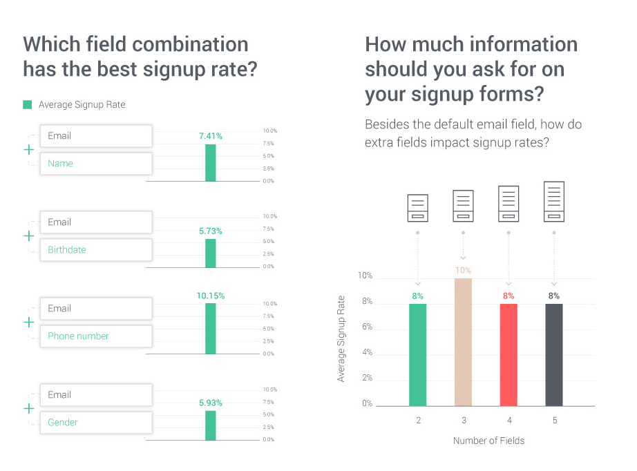
- Asking for additional information won’t ruin your signup success rate. Yet it can improve your opt-in conversion. The best number of opt-in form fields is three.
- The most popular combination is to ask for an email address and name (7%), followed by email address and birthdate (5.7%)
The Opt-in Forms That Stand Out The Most
Let’s try to understand why the numbers are what they are.

At first sight, the landing page has the best conversion of 23%. That’s the great result and you should definitely try to use one or several ones on different occasions. The best practice to use them is for contests, events, lotteries, etc.
It also explains why the conversion of landing pages is so high. People tend to provide their data more if they can win/get something in return.
However, you shouldn’t appoint your entire list building only to landing pages. The main reason why it’s because of site acquisition. If you link your customers to landing pages, you lose the opportunity to link them to your site and generate sales.
So, leave the landing pages for extraordinary occasions. You will be able to use them as trump cards when needed.
Meanwhile, the popup is the most popular opt-in form on the websites, so the sample for the average conversion rate is much bigger. It includes a lot of successful cases and a lot of bad ones. This is the main reason why the success rate of the popup is significantly lower.
Digging deeper into the popups’ performance, we’ve noticed that the exit-intent popup is more effective than other popups, both in conversion rate and user experience.
Nonetheless, counting the versatility of use and the effectiveness altogether, king of opt-in forms in 2018 was the Wheel of Fortune.
And here is why:
- The form itself works on the website without interrupting the user’s experience.
- It’s an entertaining opt-in form that results in a great conversion rate. 10% of the website visitors opt-in.
- As I have already mentioned before – people tend to provide their data more if they can win/get something in return. In this case, they get a discount or free shipping, so they are encouraged to use it right away.
Summarizing, I would recommend you consider a mix of several different forms on your site and not giving up on popups. Popups are more dynamic and do well with email capture as they get your customer’s attention. In fact, some retailers have even reported up to 1375% more subscribers by using popups over sidebar static opt-in forms.
After all, we already know that dynamic emails drive revenue up to 18 times more effectively than static emails. The same can be said for opt-in forms, like the “Wheel of Fortune” or its’ alternatives by other providers.
Additional Fields In Opt-in Forms
Opt-in forms are great and the best tool to helps you collect desired information about your customers.
Usually, entrepreneurs ask website visitors only for an email address. Today, by having an email address of the person you can reach him/her via email, target them on social media or Google ads. And that’s pretty awesome.
With that said, customers are much more wary of giving out personal information today. When we consider the recent data privacy scandals, and the GDPR, customers have every right to be more selective about how much information they give out and to whom. When it comes to computer crime it is also worth contacting professionals like these, as they are going to be a huge help.
This is why exactly how much information you ask for and what kind is critically important to the success of your email capture efforts. And most marketers stick to “less is more.”
However, collecting additional information about your site visitors gives you an opportunity to approach them with even more personal communication. For example:
- By knowing the birth date of your customer, you can send him/her effective Birthday emails.
- Having phone number turns on the green light for SMS follow-ups with your promotions.
- Also, by knowing the gender, city, and age, you can segment your audience in many useful ways and send them highly targeted messages.
What’s the best way to collect such kind of information?

According to the Omnisend infographic, a few extra fields can be in the regular opt-in form, like popup or Signup Box. The data shows that “email address + two additional fields” is optimal. This tandem results in a 10% success rate.
So it’s high time to start collecting the information that would be the most useful for your marketing strategy. For example “email+phone number”, “name+email+mobile phone”, “email+birthday date+mobile phone”, etc.
For longer questionnaires, I would suggest using landing pages. Treat them like a short mandatory form to participate in the contest or lottery. In that case, customers will have more motivation to fill it in.
Short Summary
So overall, to sum up, the biggest takeaways from this article:
- Ecommerce website should have at least several different opt-in forms for effective list building.
- Using landing pages and interactive, uncommon opt-in forms will help you to grow your subscriber database.
- Adding additional fields to your forms can lead to more signups and reveals the opportunity for more advanced marketing automation tactics.
Don’t forget, everything needs to be tested. Try something from the aforementioned tips and see how it works for your customers.
Whitney Blankenship
Latest posts by Whitney Blankenship (see all)
- The Best Performing Opt-in Forms of 2018 - February 4, 2019


